Analysing Florida theme park incidents: The road is long and full of regex

I’ve been interested in finding incident reports since I started writing this blog. In a world that seems so inherently dangerous but sells itself on being safe, I’ve been really curious what the data actually said. In this article I’m going to tell you how I found the incidents that have been reported to the Florida Government, cleaned most of it and converted it to a spreadsheet that I could actually analyse with some basic plots. Get in touch through the contact page if you’d like a copy of the original data or the final cleaned version to play with.

Finding the data

pikachu
Credit: sina.com.hk

Some Google searching managed to turn up some reports from WDWinfo and the Orlando Sentinel (not available in EU) which seemed to link to a Florida government site that has one document that appears to be continually updated through the same link.

I thought this was a bit of luck! If they were just updating the same page then I could theoretically set up a script to check it each quarter and update my data sheet. Unfortunately that fell apart really quickly as I realised it was a pdf file and pretty much impossible to read with my current skills. So I decided to do something unforgivable and just copypaste the whole thing into a spreadsheet – definitely not scalable! Little did I know that scalability would be thrown out the window very quickly as I started working with it in Python.

Pandas, but not that kind

To get this data into some sort of shape I decided to use the regex functions provided by re and pandas modules in Python. This decision was mainly because

panda
Credit: fanpop.com

Python is much faster dealing with strings than R, and pandas is a really useful (and R-like) module to make data handling even more simple.

I tried to just read it in using pandas at first, but there were way too many random commas for it to handle. That left my only option being importing the whole thing as strings, stick all the strings together and figure out how to split it myself. Thankfully there was at least a tiny bit of standardisation in the file – each line

started with a date that had a space in front of it. After a long time figuring out the regex for a date, I just started reading through regex tutorials which was really boring but really useful! From there I started pulling out whatever information I could using any patterns I could see.

import pandas as pd
import re
import csv

# I use the csv module here to read in the file because pandas was doing too much formatting for me
i = ""
with open("unformatted_incidents.csv", 'rb') as csvfile:
    incidentreader = csv.reader(csvfile)
    for row in incidentreader:
        for item in row:
            i = i + " " + str(item)

# This giant clumsy regex is to get rid of all the theme park names that snuck into the copypaste
i = re.sub(r"Wet.{1,10}Wild:|Disney:|Universal:|Sea World:|Busch Gardens:|Disney World:|Legoland:|None [Rr]eported|/{0,1}MGM:{0,1}|Epcot,{0,1}|USF|Adventure Island|Magic Kingdom", "", i)

# Now I split it on the space before each date it sees - you'll see this didn't quite work in the end.
splitlist = re.split(r' (?=[0-9]{1,2}/[0-9]{1,2}/{0,1}[0-9]{2})', i)

#Convert my list of lists into a one-column data frame
incidents = pd.DataFrame(splitlist, columns = ['a'])

# Each date has a space after it so I split on that space to get a date column
incidents['date'], incidents['stuff'] = incidents['a'].str.split(' ', 1).str
# The age of the person is the only digits left in the strings
incidents["age"] = incidents.stuff.str.extract("(\d+)", expand = True)
# The gender of the person is always in similar positions so I do a positive lookbehind to find them
incidents["gender"] = incidents.stuff.str.extract("((?<=year old ).|(?<=yo).)", expand = True)
# I look for any words before the age of the person, that's usually the ride (not always though!)
incidents["ride"] = incidents.stuff.str.extract("(.* (?=[0-9]))", expand = True)
# incidents = incidents.drop(['a'], axis = 1)
incidents.drop(incidents.index[0], inplace=True)
print incidents
incidents.to_csv("incidents.csv")

This script gave me a relatively clean dataset of around 560 incidents from 2003 – 2018 that I could at least import into R. I was celebrating at this stage thinking the pain was over, but little did I know what was to come…

Cleaning and plotting in R

scaredNow that I had something I could load, it was time to have some fun with graphs. But before I could do that, I needed to actually examine the data a bit more. This all looked fine at first – most things had a date and age and gender, but when I looked at the levels of the ‘rides’ column my blood turned cold as I realised how human generated this data really was.  I had 206 rides in the set, but as I started scrolling through them, almost all of them had duplicates with different spelling, capitalisations and punctuation. Spiderman was both “Spider Man” and “Spider-Man”. And don’t even talk about the Rip Ride Rockit and the million spellings they’ve used over the years in the report. This meant a LOT of dumb and non-scalable coding to clean it up:

library(data.table)
library(ggplot2)
incidents <- fread("~/Data/dis_incidents.csv")
incidents <- incidents[, V1 := NULL][,date := as.POSIXct(date, format = "%m/%d/%y"), ][, ride := as.factor(ride),][, condition := grepl("pre[-| |e]", incidents$stuff), ][, year := year(date)][!is.na(date)][year < 2019]

levels(incidents$ride) <- trimws(levels(incidents$ride), which = "both")
levels(incidents$ride) <-gsub(",|;|/.", "", levels(incidents$ride))

levels(incidents$ride) <- tolower(levels(incidents$ride))
levels(incidents$ride)[levels(incidents$ride)%like% "rock" & !levels(incidents$ride)%like% "rip"] <- "rock n rollercoaster"
levels(incidents$ride)[levels(incidents$ride)%like% "soar"] <- "soarin"
levels(incidents$ride)[levels(incidents$ride)%like% "under"] <- "under the sea jtlm"
levels(incidents$ride)[levels(incidents$ride)%like% "storm"] <- "storm slides"
levels(incidents$ride)[levels(incidents$ride)%like% "transformers"] <- "transformers"
levels(incidents$ride)[levels(incidents$ride)%like% "mission"] <- "mission space"
levels(incidents$ride)[levels(incidents$ride)%like% "hulk"] <- "incredible hulk coaster"
levels(incidents$ride)[levels(incidents$ride)%like% "sim"] <- "the simpsons"
levels(incidents$ride)[levels(incidents$ride)%like% "men"] <- "men in black"
levels(incidents$ride)[levels(incidents$ride)%like% "kil"] <- "kilimanjaro Safaris"
levels(incidents$ride)[levels(incidents$ride)%like% "tom"] <- "tomorrowland speedway"
levels(incidents$ride)[levels(incidents$ride)%like% "harry potter" & levels(incidents$ride)%like% "escape"] <- "hp escape from gringotts"
levels(incidents$ride)[levels(incidents$ride)%like% "harry potter" & levels(incidents$ride)%like% "forbid"] <- "hp forbidden journey"
levels(incidents$ride)[levels(incidents$ride)%like% "pirate"] <- "pirates of the caribbean"
levels(incidents$ride)[levels(incidents$ride)%like% "honey"] <- "honey i shrunk the kids"
levels(incidents$ride)[levels(incidents$ride)%like% "caro-"] <- "caro-seuss-el"
levels(incidents$ride)[levels(incidents$ride)%like% "buzz"] <- "bl spaceranger spin"

levels(incidents$ride)[levels(incidents$ride) %like% "everest"] <- "expedition everest" 
levels(incidents$ride)[levels(incidents$ride) %like% "astro"] <- "astro orbiter" 
levels(incidents$ride)[levels(incidents$ride) %like% "typhoon"|levels(incidents$ride) %like% "wave pool"|levels(incidents$ride) %like% "surf pool" ] <- "typhoon lagoon" 
levels(incidents$ride)[levels(incidents$ride) %like% "tob"] <- "toboggan racer" 
levels(incidents$ride)[levels(incidents$ride) %like% "progress"] <- "carousel of progress" 
levels(incidents$ride)[levels(incidents$ride) %like% "rip" & !levels(incidents$ride) %like% "saw"] <- "rip ride rockit" 
levels(incidents$ride)[levels(incidents$ride) %like% "knee"] <- "knee ski"
levels(incidents$ride)[levels(incidents$ride) %like% "spider"] <- "spiderman"
levels(incidents$ride)[levels(incidents$ride) %like% "seas"] <- "seas w nemo and friends"
levels(incidents$ride)[levels(incidents$ride) %like% "terror"] <- "tower of terror"
levels(incidents$ride)[levels(incidents$ride) %like% "dinos"] <- "ak dinosaur"
levels(incidents$ride)[levels(incidents$ride) %like% "bliz"] <- "blizzard beach"
levels(incidents$ride)[levels(incidents$ride) %like% "space m"] <- "space mountain"
levels(incidents$ride)[levels(incidents$ride) %like% "drag" & levels(incidents$ride) %like% "chal"] <- "dragon challenge"
levels(incidents$ride)[levels(incidents$ride) %like% "drag" & levels(incidents$ride) %like% "chal" |levels(incidents$ride) %like% "duel" ] <- "dragon challenge"
levels(incidents$ride)[levels(incidents$ride) %like% "dragon coas"] <- "dragon coaster"
levels(incidents$ride)[levels(incidents$ride) %like% "rapid"& levels(incidents$ride) %like% "roa"] <- "roa rapids"
levels(incidents$ride)[levels(incidents$ride) %like% "riverboat" | levels(incidents$ride) %like% "liberty"] <- "liberty riverboat"
levels(incidents$ride)[levels(incidents$ride) %like% "jurassic"] <- "camp jurassic"
levels(incidents$ride)[levels(incidents$ride) %like% "seven"] <- "seven dwarves mine train"
levels(incidents$ride)[levels(incidents$ride) %like% "prince"] <- "prince charming carousel"
levels(incidents$ride)[levels(incidents$ride) %like% "toy"] <- "toy story mania"
levels(incidents$ride)[levels(incidents$ride) %like% "peter"] <- "peter pans flight"
levels(incidents$ride)[levels(incidents$ride) %like% "mayd"] <- "mayday falls"
levels(incidents$ride)[levels(incidents$ride) %like% "crush"] <- "crush n gusher"
levels(incidents$ride)[levels(incidents$ride) %like% "test track"] <- "test track"
levels(incidents$ride)[levels(incidents$ride) %like% "manta"] <- "manta"
levels(incidents$ride)[levels(incidents$ride) %like% "despic"] <- "dm minion mayhem"
levels(incidents$ride)[levels(incidents$ride) %like% "passage"] <- "flight of passage"
levels(incidents$ride)[levels(incidents$ride) %like% "mummy"] <- "revenge of the mummy"
levels(incidents$ride) <- gsub("e\\.t\\.", "et", levels(incidents$ride))

ridesort <- incidents[, .N, by = ride][1:10]
ridesort$ride <- factor(ridesort$ride, levels = ridesort$ride[order(-ridesort$N)])
ggplot(data = incidents[!is.na(age)], aes(age)) + geom_histogram(breaks=seq(0, 95, by =5), col=" blue", fill="black") + ggtitle("Florida theme park reported incidents by age") + xlab("Age") + ylab("Incidents") + scale_x_continuous(breaks = seq(0, 100, by = 5))


ggplot(data = incidents[!gender == ""][ride %in% c("expedition everest", "prince charming carousel", "typhoon lagoon")], aes(gender)) + geom_histogram(breaks=seq(0, 95, by =2), col=" blue", fill="black", stat = "count") + theme(legend.position="none") + ggtitle("Florida theme park reported incidents by gender") + xlab("Gender") + ylab("Incidents") + facet_wrap( ~ ride)

ggplot(data = incidents[!gender == ""], aes(x= year)) + geom_histogram(col=" blue", fill = "black", binwidth = 1) + theme(legend.position="none") + ggtitle("Florida theme park reported incidents by year") + xlab("Year") + ylab("Incidents") + xlim(c(2002, 2018))

ridesort$ride <- factor(ridesort$ride, levels = ridesort$ride[order(-ridesort$N)])
ggplot(data = ridesort, aes(x = ride, y = N)) + geom_col(col = "blue", fill = "black") + theme(axis.text.x = element_text(angle = 90, hjust = 1)) + ggtitle("Florida reported incidents by ride")

Now I’m totally willing to hear about any way I could have done this better, but to be honest with the exception of a few &’s and |’s I don’t see how it could have been much shorter. The problem is that when you have humans typing data themselves and submitting it to the government as a document, there is very little control over standardisation. Having cut my 206 rides down to 112 by merging duplicates, I can actually get some interesting graphs and numbers.

Results

The first thing I did was to check out how many people in the list had pre-existing conditions. About 14.8% of people had pre-existing conditions reported, which only tells us that being healthy generally doesn’t really protect you from a theme park accident.

Demographics

From here the next interesting things were to look at incidents by the very few demographic variables I was able to get:

gender_incidents

This could have been interesting to see, but it’s pretty much as you’d expect – men and women have about the same number of incidents as each other. This seems to play out across all the rides except a couple of them. Here’s the three with the biggest differences:

ride_gender_incidents 
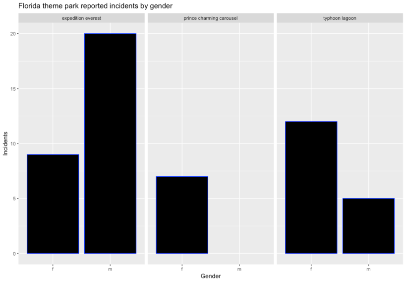
It probably strikes you looking at the middle graph what’s happening here – some rides are definitely favoured by one gender. I’m assuming here that the Prince Charming Carousel at Magic Kingdom is probably favoured by young girls, and not that there’s some witch blocking the prince from future suitors in order to maintain some curse of course. Having said that, the other two do surprise me a bit – I didn’t really think that Expedition Everest would be so heavily favoured by males. My hypothesis is that Animal Kingdom (which hosts the ride) is really not heavy on thrill rides, so the park itself is probably less aimed at males who anecdotally prefer thrill rides more. I can definitely imagine a scenario where a family split up for an hour, with Mum and the girls going to look at the animals while Dad and the boys go ride the rollercoaster with the broken Yeti (fix the Yeti!). If I’m right, Expedition Everest is not really a ‘boy ride’ like it appears, it’s just the least female-friendly ride in the park.


age_incidents

This one is a lot more interesting to me because there looks like a really clear spike at age 40-45. I really expected this one to have a smoother curve, but once again I think we’re victims of selection bias. If you think about who goes to parks, it’s still generally families with children (although my bet is that will change soon). So these 40 and above people are most likely parents, and before 40 in the US you’re unlikely to have kids of theme park age. So rather than the spike being interesting, it becomes more interesting to me to wonder why there’s so few kids – after all, they’re riding just as much if not more! My only conclusion then is that the average for under 20’s compared to the over 40’s is really an expression of how resilient kids are compared to their parents.

The next interesting part of this graph to me is the spike between 60 and 65. I think after 65 you’re really much less likely to be going to theme parks at all, so this spike might really mean something. While we really don’t have enough evidence to make a call, I’d definitely be thinking about a quieter holiday location once I get to 60.

Reporting over time

One of the biggest things I noticed when looking at the original report was that the format and standards for reporting have evolved a lot over time. In the beginning you can see that reporting was a real afterthought, and very little information was provided. Most of the work I had to do in Regex was for the first two years of the dataset, so my suspicion is that they weren’t reporting everything. This seems to play out when you graph it:

year_incidents

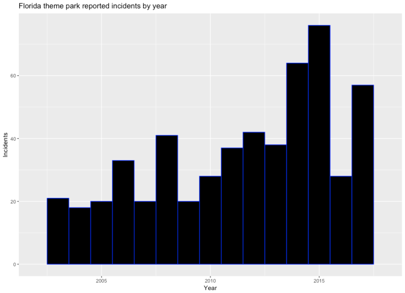
It really looks like a few things could be happening here. The first interesting thing is that more people seem to hurt themselves from 2010 onwards, but then it cuts out to 2009 levels in 2016. This could mean that parks reacted to a bad 2015 by reinforcing their safety standards, which would be a good news story. The not so good news is that in 2017 the numbers seem to climb again. There’s a few stories of how bad 2015 was, but Orlando Sentinel being blocked for me doesn’t help supplying them to you.

Incidents by ride

I wanted to save my opinion of the best for last – the incidents by ride. As with all of these graphs, the raw counts of incidents are heavily affected by popularity, which I can’t really get directly (although I’m working on it!).

Rrde_incidents

I’ve only plotted the top ten rides here, but I might show the full graph in a later article. On its own this is pretty interesting to me, because it backs up a lot of folklore about Space Mountain and Harry Potter and the Forbidden Journey being particularly intense. My first reaction was that HPFJ must be horribly built or something, but the fact that it has won awards doesn’t imply that’s correct. Then I spoke to a friend from Florida who told me that the ride is famous for people throwing up on it as it swings them around, which makes it far more likely that the high number of incidents is more due to minor incidents than anything. Space Mountain, on the other hand is an old dark coaster – a breed of ride notorious for knocking people about because the darkness means you can’t brace for the turns. Without being able to actually extract the incidents themselves well yet it’s difficult to tell for sure, but a glance at the raw data tells me that the injuries are a bit more serious on this ride. Mission Mars also has a reputation for being intense – a lot of people seem to at least get disoriented on this ride and one incident is even a 4 year old boy who died during the experience.

Expedition Everest and the case of the Yeti

The standout ride again for me is Expedition Everest, and I really can’t explain what’s going on there. It’s not known as a particularly dangerous or intense ride, and I haven’t seen any majorly new technology on it.

yeti
Credit: WDWnews

My only clue is the the broken Yeti. I know it’s a long shot, but the Bayesian in me is saying the fact that the Yeti only worked for a short time before staying motionless to this day indicates that something went wrong in the design process for this ride. After all, if such a major set piece turned out to operate unexpectedly, what else is operating unexpectedly? Combine it with an unusually high number of incidents for a largely outdoor rollercoaster with no inversions or particularly tight curves and there is a weak sign here that someone designed this thing wrong. Having said that, there is a reverse section of the ride (which has the same effect as a dark coaster), so it could be just that section that’s the problem.  I know absolutely nothing about Disney maintenance schedules of their organisational structure, but it might be possible that Animal Kingdom doesn’t have the same number of staff assigned to structural engineering tasks as other parks. Obviously if I knew anything about their operations my hypothesis would be a lot better, but I still think this is an interesting data point.

What I learned and what I’ll do next

The first thing I’ve learned is that the Florida Government needs to start making theme parks standardise their reports and preferably submitting them as publicly available csv files. If they were doing this with drop down menus and some sort of field validation, getting reports out would be a hell of a lot easier.

Another thing I learned (while I didn’t get to make graphs of it particularly) was that it seems getting on and off a ride is more dangerous than actually being on the ride itself. While I only got to eyeball the incidents in this iteration of the analysis, I was surprised to see how many said things like ‘tripped entering vehicle, fractured ankle’ or something similar. While I don’t get the inside knowledge the Disney or Universal Data Scientists do, I’m not surprised that entering and exiting ride vehicles has so many humans involved in it, and if it were me I’d be making sure these people were permanent employees with excellent training to particularly look after people over 40.

That brings me to another thing – if you’re a parent the clear message here is that your kids will be fine and you should be far more worried about your own safety than theirs. They might be running around like maniacs, but just because the place is dangerous for you doesn’t mean it is for them!

Now that I’ve finally gained a new dataset, my next thing will probably be to try and combine it with some of the other datasets I have, like the theme park visitor numbers or (hopefully) ride wait times to indicate ride popularity. If I can line these things up it might control for the growth of the industry overall, and then I’ll be able to tell if things really are getting more dangerous or if it’s just a side-effect of increasing visitors. In addition, I’m going to try and see if I can extract a few types of incidents and do a post on which rides seem to be most deadly (which would be sad) or most sickening (which would be more fun).

If you have more ideas on where I can get data or what I could do better in my code I’d love to hear your suggestions in the comments.

What are people saying about amusement parks? A Twitter sentiment analysis using Python.

One of the quintessential tasks of open data is sentiment analysis. A very common example of this is using tweets from Twitter’s streaming API. In this article I’m going to show you how to capture Twitter data live, make sense of it and do some basic plots based on the NLTK sentiment analysis library.

What is sentiment analysis?

minnieThe result of sentiment analysis is as it sounds – it returns an estimation of whether a piece of text is generally happy, neutral, or sad. The magic behind this is a Python library known as NLTK – the Natural Language Toolkit. The smart people that wrote this package took what is known about Natural Language Processing in the literature and have packaged it for dummies like me to use. In short, it has a database of commonly used positive and negative words that it checks against and does a basic vote count – positives are 1 and negatives are -1, with the final result being positive or negative. You can get really smart about how exactly you build the database, but in this article I’m just going to stick with the stock library that it comes with.

Asking politely for your data

Twitter is really open with their data, and it’s worth being nice in return. That means telling them who you are before you start crawling through their servers. Thankfully, they’ve made this really easy as well.tweety

Surf over to the Twitter Apps site, sign in (or create an account if you need to, you luddite) and click on the ‘Create new app’ button. Don’t freak out – I know you’re not an app developer! We just need to do this to create an API key. Now click on the app you just created, then on the ‘Keys and Access Tokens’ tab. You’ll see four strings of letters – Your consumer key, consumer secret, access key ad access secret. Copy and paste these and store them somewhere only you can get to – off line on your local drive. If you make these public (by publishing them on github for example) you’ll have to disable them immediately and get new ones. Don’t underestimate how much a hacker with your key can completely screw you and Twitter and everyone on it – with you taking all the blame.

Now the serious, scary stuff is over we can get to streaming some data! The first thing we’ll need to do is create a file that captures the tweets we’re interested in – in our case anything mentioning Disney, Universal or Efteling. I expect that there’ll be a lot more for Disney and Universal given they have multiple parks globally, but I’m kind of interested to see how the Efteling tweets do just smashing them into the NLTK work flow.

Here’s the Python code you’ll need to start streaming your tweets:

# I adapted all this stuff from http://adilmoujahid.com/posts/2014/07/twitter-analytics/ - check out Adil's blog if you get a chance!

#Import the necessary methods from tweepy library
import re
from tweepy.streaming import StreamListener
from tweepy import OAuthHandler
from tweepy import Stream

#Variables that contains the user credentials to access Twitter API
access_token = "XXXXXXXXXXXXXXXXXXXXXXXXXXXXXXXXXXXXXXXXXXXXX"
access_token_secret = "XXXXXXXXXXXXXXXXXXXXXXXXXXXXXXXXXXXXXXXXXXXX"
consumer_key = "XXXXXXXXXXXXXXXXXXXXXXXXXXXXXXXXXXXXXXXXXXX"
consumer_secret = "XXXXXXXXXXXXXXXXXXXXXXXXXXXXXXXXXX"


#This is a basic listener that just prints received tweets to stdout.
class StdOutListener(StreamListener):

    def on_data(self, data):
        print data
        return True

    def on_error(self, status):
        print status


if __name__ == '__main__':

    #This handles Twitter authentification and the connection to Twitter Streaming API
    l = StdOutListener()
    auth = OAuthHandler(consumer_key, consumer_secret)
    auth.set_access_token(access_token, access_token_secret)
    stream = Stream(auth, l)
    #This line filter Twitter Streams to capture data by the keywords commonly used in amusement park tweets.
    stream.filter(track= [ "#Disneyland", "#universalstudios", "#universalstudiosFlorida", "#UniversalStudiosFlorida", "#universalstudioslorida", "#magickingdom", "#Epcot","#EPCOT","#epcot", "#animalkingdom", "#AnimalKingdom", "#disneyworld", "#DisneyWorld", "Disney's Hollywood Studios", "#Efteling", "#efteling", "De Efteling", "Universal Studios Japan", "#WDW", "#dubaiparksandresorts", "#harrypotterworld", "#disneyland", "#UniversalStudios", "#waltdisneyworld", "#disneylandparis", "#tokyodisneyland", "#themepark"])

If you’d prefer, you can download this from my Github repo instead here. To be able to use it you’ll need to install the tweepy package using:

pip install tweepy

The only  other thing you have to do is enter the strings you got from Twitter in your previous step and you’ll have it running. To save this to a file, you can use the terminal (cmd in windows) by running:

python theme_park_tweets.py > twitter_themeparks.txt

For a decent body of text to analyse I ran this for about 24 hours. You’ll see how much I got back for that time and can make your own judgment. When you’re done hit Ctrl-C to kill the script, then open up the file and see what you’ve got.

Yaaaay! Garble!

So you’re probably pretty excited by now – we’ve streamed data live and captured it! You’ve probably been dreaming for the last 24 hours about all the cool stuff you’re going to do with it. Then you get this:

{"created_at":"Sun May 07 17:01:41 +0000 2017","id":861264785677189
120,"id_str":"861264785677189120","text":"RT @CCC_DisneyUni: I have
n't been to #PixieHollow in awhile! Hello, #TinkerBell! #Disney #Di
sneylandResort #DLR #Disneyland\u2026 ","source":"\u003ca href=\"ht
tps:\/\/disneyduder.com\" rel=\"nofollow\"\u003eDisneyDuder\u003c\/
a\u003e","truncated":false,"in_reply_to_status_id":null,"in_reply_t
o_status_id_str":null,"in_reply_to_user_id":null,"in_reply_to_user
_id_str":null,"in_reply_to_screen_name":null,"user":{"id":467539697
0,"id_str":"4675396970","name":"Disney Dude","screen_name":"DisneyDu
der","location":"Disneyland, CA","url":null,"description":null,"pro
tected":false,"verified":false,"followers_count":1237,"friends_coun
t":18,"listed_count":479,"favourites_count":37104,"statuses_count":
37439,"created_at":"Wed Dec 30 00:41:42 +0000 2015","utc_offset":nu
ll,"time_zone":null,"geo_enabled":false,"lang":"en","contributors_e
...

huhSo, not quite garble maybe, but still ‘not a chance’ territory. What we need is something that can make sense of all of this, cut out the junk, and arrange it how we need it for sentiment analysis.

To do this we’re going to employ a second Python script that you can find here. We use a bunch of other Python packages here that you might also need to install with pip – json, pandas, matplotlib, and TextBlob (which contains the NLTK libraries I mentioned before). If you don’t want to go to Github (luddite), the code you’ll need is here:

import json
import pandas as pd
import matplotlib.pyplot as plt
from textblob import TextBlob
import re

# These functions come from https://github.com/adilmoujahid/Twitter_Analytics/blob/master/analyze_tweets.py and http://www.geeksforgeeks.org/twitter-sentiment-analysis-using-python//

def extract_link(text):
    """
    This function removes any links in the tweet - we'll put them back more cleanly later
    """
    regex = r'https?://[^\s<>"]+|www\.[^\s<>"]+'
    match = re.search(regex, text)
    if match:
        return match.group()
    return ''

def word_in_text(word, text):
    """
    Use regex to figure out which park or ride they're talking about.
    I might use this in future in combination with my wikipedia scraping script.
    """
    word = word.lower()
    text = text.lower()
    match = re.search(word, text, re.I)
    if match:
        return True
    return False

def clean_tweet(tweet):
        '''
        Utility function to clean tweet text by removing links, special characters
        using simple regex statements.
        '''
        return ' '.join(re.sub("(@[A-Za-z0-9]+)|([^0-9A-Za-z \t])|(\w+:\/\/\S+)", " ", tweet).split())

def get_tweet_sentiment(tweet):
    '''
    Utility function to classify sentiment of passed tweet
    using textblob's sentiment method
    '''
    # create TextBlob object of passed tweet text
    analysis = TextBlob(clean_tweet(tweet))
    # set sentiment
    if analysis.sentiment.polarity > 0:
        return 'positive'
    elif analysis.sentiment.polarity == 0:
        return 'neutral'
    else:
        return 'negative'

# Load up the file generated from the Twitter stream capture.
# I've assumed it's loaded in a folder called data which I won't upload because git.
tweets_data_path = '../data/twitter_themeparks.txt'

tweets_data = []
tweets_file = open(tweets_data_path, "r")
for line in tweets_file:
    try:
        tweet = json.loads(line)
        tweets_data.append(tweet)
    except:
        continue
# Check you've created a list that actually has a length. Huzzah!
print len(tweets_data)

# Turn the tweets_data list into a Pandas DataFrame with a wide section of True/False for which park they talk about
# (Adaped from https://github.com/adilmoujahid/Twitter_Analytics/blob/master/analyze_tweets.py)
tweets = pd.DataFrame()
tweets['user_name'] = map(lambda tweet: tweet['user']['name'] if tweet['user'] != None else None, tweets_data)
tweets['followers'] = map(lambda tweet: tweet['user']['followers_count'] if tweet['user'] != None else None, tweets_data)
tweets['text'] = map(lambda tweet: tweet['text'], tweets_data)
tweets['retweets'] = map(lambda tweet: tweet['retweet_count'], tweets_data)
tweets['disney'] = tweets['text'].apply(lambda tweet: word_in_text(r'(disney|magickingdom|epcot|WDW|animalkingdom|hollywood)', tweet))
tweets['universal'] = tweets['text'].apply(lambda tweet: word_in_text(r'(universal|potter)', tweet))
tweets['efteling'] = tweets['text'].apply(lambda tweet: word_in_text('efteling', tweet))
tweets['link'] = tweets['text'].apply(lambda tweet: extract_link(tweet))
tweets['sentiment'] = tweets['text'].apply(lambda tweet: get_tweet_sentiment(tweet))

# I want to add in a column called 'park' as well that will list which park is being talked about, and add an entry for 'unknown'
# I'm 100% sure there's a better way to do this...
park = []
for index, tweet in tweets.iterrows():
    if tweet['disney']:
        park.append('disney')
    else:
        if tweet['universal']:
            park.append('universal')
        else:
            if tweet['efteling']:
                park.append('efteling')
            else:
                park.append('unknown')

tweets['park'] = park

# Create a dataset that will be used in a graph of tweet count by park
parks = ['disney', 'universal', 'efteling']
tweets_by_park = [tweets['disney'].value_counts()[True], tweets['universal'].value_counts()[True], tweets['efteling'].value_counts()[True]]
x_pos = list(range(len(parks)))
width = 0.8
fig, ax = plt.subplots()
plt.bar(x_pos, tweets_by_park, width, alpha=1, color='g')

# Set axis labels and ticks
ax.set_ylabel('Number of tweets', fontsize=15)
ax.set_title('Tweet Frequency: disney vs. universal vs. efteling', fontsize=10, fontweight='bold')
ax.set_xticks([p + 0.4 * width for p in x_pos])
ax.set_xticklabels(parks)
# You need to write this for the graph to actually appear.
plt.show()

# Create a graph of the proportion of positive, negative and neutral tweets for each park
# I have to do two groupby's here because I want proportion within each park, not global proportions.
sent_by_park = tweets.groupby(['park', 'sentiment']).size().groupby(level = 0).transform(lambda x: x/x.sum()).unstack()
sent_by_park.plot(kind = 'bar' )
plt.title('Tweet Sentiment proportions by park')
plt.show()

The Results

If you run this in your terminal, it spits out how many tweets you recorded overall, then gives these two graphs:

tweet_freqtweet_sent

So you can see from the first graph that out of the tweets I could classify with my dodgy regex skills, Disney was by far the most talked about, followed by Universal a long way. This is possibly to do with genuine popularity of the parks and the enthusiasm of their fans, but it’s probably more to do with the variety of hashtags and keywords people use for Universal compared to Disney. In retrospect I should have added a lot more of the Universal brands as keywords – things like Marvel or NBC. Efteling words didn’t really pick up much at all which isn’t really surprising – most of the tweets would be in Dutch and I really don’t know what keywords they’re using to mark them. I’m not even sure how many Dutch people use Twitter!

The second graph shows something relatively more interesting – Disney parks seem to come out on top in terms of the proportion of positive tweets as well. This is somewhat surprising – after all Universal and Efteling should elicit the same levels of positive sentiment – but I really don’t trust these results at this point.  For one, there’s a good number of tweets I wasn’t able classify despite filtering the terms in the initial script. This is probably to do with my regex skills, but I’m happy that I’ve proved the point and done something useful in this article. Second, there’s far too many neutral tweets in the set, and while I know most tweets are purely informative (“Hey, an event happened!”) this is still too high for me to not be suspicious. When I dig into the tweets themselves I can find ones that are distinctly negative(“Two hours of park time wasted…”) that get classed as neutral. It seems that the stock NLTK library might not be all that was promised.

Stuff I’ll do next time

There’s a few things I could do here to improve my analysis. First, I need to work out what went wrong with my filtering and sorting terms that I ended up with so many unclassified tweets. There should be none, and I need to work out a way for both files to read from the same list.

Second, I should start digging into the language libraries in Python and start learning my own from collected data. This is basically linguistic machine learning, but it requires that I go through and rate the tweets myself – not really something I’m going to do. I need to figure out a way to label the data reliably then build my own libraries to learn from.

Finally, all this work could be presented a lot better in an interactive dashboard that runs off live data. I’ve had some experience with RShiny, but I don’t really want to switch software at this point as it would mean a massive slowdown in processing. Ideally I would work out a javascript solution that I can post on here.

Let me know how you go and what your results are. I’d love to see what things you apply this code to. A lot of credit goes to Adil Moujahid and Nikhil Kumar, upon whose code a lot of this is based. Check out their profiles on github when you get a chance.

Thanks for reading, see you next time 🙂

5 ways Theme Parks could embrace blockchain technology, and why they should

The theme park world has been known to embrace all forms of new technology, from Virtual Reality in rides to recommendation systems on mobile apps and the famous touchless payment technology like Disney’s Magic Bands that now pervades all major theme parks globally. But while the methods of delivering the theme park experience are as advanced as they come in any industry, the systems behind all of it are sorely lacking. The experience of booking tickets and organising the visit is often a lot more stressful than it needs to be, and anything that minimises this process is likely to be well received.

Meanwhile, the digital world is undergoing a change in the way it stores information and makes financial transactions. A technology known broadly as ‘blockchain‘ is gaining more and more attention amongst development circles, and it promises a new way of interacting with data altogether free of server costs or security issues. You’ve probably heard of the first major application of the blockchain known as Bitcoin – an

blockchain
A diagram of how the blockchain works.

entirely digital currency given value by those who use it. But for all the hype you’ve heard about Bitcoin, this is only the very pointy tip of a continent sized iceberg. The next iteration of cryptocurrency is called Ethereum, and its applications to the theme park world are far ranging and incredible.

1. Ticketing

Ticketing is probably the most obvious application of the blockchain to the operations of theme parks. There are already a range of interesting Ethereum based ‘dapps‘ that promise ticketing services for music festivals and concerts at a fraction of the price of current services. Because the blockchain only ever allows one copy of a digital property (such as a ticket to a theme park), users can have a password protected wallet on their phone (which is pretty much how you do everything with these dapps) that contains the digital tickets signed by the park which are scanned at the gate, at which time the payment transfer is finalised between the guest’s wallet and the theme park’s. No id, no paper tickets, just a secure decentralised system approved by consensus.

What’s more, these digital tickets don’t have to be bought all at once or even by the same person. A guest  who knows they want to go to the park a year out can make a promise to buy a ticket, which they can then pay off at their will over the remaining time they have. The blockchain can easily store the payment history of the guest without any specific human approval or oversight.

Now that your tickets are digital assets that you don’t need to keep an eye on, you can pretty much allow people to do whatever they want with them. Ethereum has the ability to run ‘smart contracts’ (executable code with instructions to carry out actions based on triggers), so any time someone sells on your park’s tickets at a profit you can get a cut. Say you take 50% of any resales as part of the contract when you sell the ticket. On popular days that ticket might go through any number of hands, and you are making money each time without any effort while also allowing others to make money from their good predictions.

2. Ride fastpass tracking and swaps

Similar to theme park ticketing, fastpass tickets for ride queues  like this one at Universal, or the equivalent at Walt Disney World can be entirely controlled through smart contracts giving them much more flexibility than the current systems. The current system has a whole range of books and forums dedicated to how to game it, with people spending hours trying to get the best ride times and cover the rest of their favourite rides through careful planning. It surely doesn’t need to be so stressful.

But what if everything switched over to a bidding system with every guest given equal opportunity to start with? You could provide guests with some tokens to spend on fastpasses when they buy a ticket, then use a demand based system for the token cost of each ride in the park. The hardcore fans can spend all their tokens on doing the newest ride at the most popular times, while the kids can spend theirs on riding the Jungle Cruise for the five millionth time. Now that you’ve established a within-park market for ride times, there’s nothing stopping you from selling additional tokens to guests buying premium packages, or to their relatives wishing them a good holiday.

The cool thing about this is that you get a lot more information about which rides people really wanted to go on, because you can track the ‘price’ and watch them trading with each other. This would let you start really improving your recommendations to them, giving them indications of rides they might like and good times to ride them that suit their intended schedule.

3. Create a theme park currency

You can probably see where all this is heading – a theme park currency that can be used at any of the park owner’s subsidiary and affiliate businesses. A majority of people that

dollars
Disney Dollars, not such a great investment.

visit premium parks now download the app before they go so they can organise their day and use the map. It’s not a great step for that app to become a digital wallet that visitors can use in your parks, stores and even online platforms. What makes this a digital currency rather than the old school version of ‘park dollars’, these could be exchanged back into local currency anywhere someone wants to set up an exchange. On its own the prospect of having a future corporate currency that could be more stable than many local governments is interesting, but the immediate benefits are still compelling. Once you transfer your ticketing, fastpasses, merchandising and digital distribution payments through one channel that doesn’t require a bank, your accounting suddenly becomes a lot simpler.

The concept is especially exciting for larger brands who may not have a park but do have a store in a particular country. The park currency can be used in all these stores without having to make special banking or business arrangements, allowing for much faster expansion into new markets. With incredibly low transfer costs between countries, theme parks that embrace blockchain would be able to capitalise on the post-visit experience much more effectively.

4. Audience surveys with meaning

One of the most popular early uses of the Ethereum cryptocurrency was as a voting system. Rather than a one person one vote approach, The DAO (the earliest manifestation of an Ethereum organisation) used a share based system where those with more coins had more vote. While this may not be exactly what you want for your theme park, having a good knowledge of what the highest spenders in your park are looking for is a useful thing. On top of that, you might also see a groundswell of grassroots support from lower-spending guests  (like Universal saw with the opening of Harry Potter worlds in Florida) which would give you an indication that you need to build a ride with high throughput  that doesn’t need a lot of stores nearby. Whatever the outcome, an audience survey with the answers weighted by how much they have invested in your company is a hell of a lot more useful than standing around on corners asking people how they feel without having a clue how valuable they are to you.

5. Turn everyone into an ambassador

Once you have your audience used to using your park’s currency and it’s gained some value, there’s more and more benefit to offering what are essentially cash rewards for advertising and information about your park. This could be as basic as forwarding coins to a wallet linked to a twitter account that posts lost of highly retweeted content, or as sophisticated as a real time rewards for advice about park waiting times, incident reports, and events. There are already dozens of forums online vying to be the expert of

disflash.jpeg
Flashmobs, in case you want to travel back to 2013.

one park or another, why not bring it all into your own app ecology and reward your guests for their effort?
You could create flashmobs in the park with your most loyal fans by incentivising them with tokens, as could any guest with enough tokens and approval from the park’s digital protocols. There is no end to the ways people could build secondary and tertiary businesses around your brand, and with the right protocols you wouldn’t need to spend a cent on protecting it.

There’s a massive range of ways which theme parks can use blockchain technology, and it’s exciting to imagine what the future might hold. What other ways could theme parks use this type of technology, and should they be looking at this at all? It would be great to hear your opinion.

Getting Disney ride lists from Wikipedia using Python and BeautifulSoup

disneysoup
This soup is not beautiful

I’ve been pretty quiet on this blog for the last few weeks, because as I mentioned a few times I was hitting the limit of what I could do with the data I could collect manually. Manual data collection is one of my most hated tasks since working as a researcher in the Social Sciences. Back then we had to encode thousands of surveys manually, but in a scenario where the outcome was within a set range of parameters (their answers had to add up to 100 for example). They insisted at the time on manually checking the input , and (groan) colour coding the spreadsheets by hand when there looked like there was a problem. It was the first time I had used conditional formatting in Excel to automate such an arduous task, and I remember everyone’s suspicion that I had finished so quickly.


Nowadays I work in a tech company dealing with the proverbial ‘Big Data’ that everyone goes on about. In these scenarios manual coding or checking of your data is not just arduous, it’s absolutely impossible so automation of your task is a necessity.

Grey Data

A recent article I read interviewing someone from Gartner stated that more than 99% of the information on the Internet is ‘grey data’. By this they mean unstructured, unformatted data with themes and meanings hidden beneath layers of language, aesthetics, semiotics and code. Say I want to find out what people think about Universal theme parks in the universe of WordPress blogs. It’s pretty rare that the site itself is tagged with any metadata telling a machine ‘in this blog I’m talking about theme parks and how I feel about Universal’. However, if I can use a script that reads all the blogs that contain the words ‘theme park’ and ‘Universal’, I’d be somewhere closer to finding out how people feel about Universal Theme Parks generally. On top of this, all these blogs probably have memes about Universal attractions and IP, they all use specific fonts and layouts, they’ll all use images of the Universal offerings. If I were able to read these and classify them into something shorter and more standardised, I’d be able to learn a lot more about what people are saying.

From little things, big things grow

As someone with more of an analytical background than a data engineering one, I’ve always been afraid of building my own datasets. In statistics we keep telling each other that we’re specialists, but the reality of the Data Science world is that specialists are just not needed yet – if you’re going to make your bones in the industry you’re going to have to get generalist skills including querying MySQL and Hadoop, and using Spark and Python.  As such, the project I’ve undertaken is to start scraping Wikipedia (to begin with) and see if I can build a bit of a database of theme park knowledge that I can query, or analyse in R.

Scraping isn’t the hard part

So I started looking around online and found a few resources on scraping Wikipedia, but they were either outdated or simply didn’t seem to work. There was also the option of dbpedia, which uses the Linked Data Standards to try and build a sort of dynamic relational database online by scraping the less standardised site. This option sounded really useful, but it looks like they’re still very much trying to flesh out WikiDB and it’s unlikely they’ll get to theme park lists any time soon. So, it looks like I’m stuck with StackOverflow threads on what to do.

The first stuff I started looking at told me to use BeautifulSoup, which I had never heard of. In short, the way I use it is as a Python module that handles specific http requests for tables. It seems to be able to parse out the site code and use the standard flags to identify where the table starts and finishes, and then assign the table to an object in Python that you can do things to.

from bs4 import BeautifulSoup
import re
import urllib2
import csv

# Define the page you want to scrape and set up BeautifulSoup to do its magic
wiki = "http://en.wikipedia.org/wiki/List_of_Disney_theme_park_attractions"
header = {'User-Agent': 'Mozilla/5.0'} #Needed to prevent 403 error on Wikipedia
req = urllib2.Request(wiki,headers=header)
page = urllib2.urlopen(req)
soup = BeautifulSoup(page, "lxml")

attraction = []
full_details = []

But then all you have is a bunch of jargon that looks like this:

<td><a class=”mw-redirect” href=”/wiki/WEDway_people_mover” title=”WEDway people mover”>WEDway people mover</a> (aka Tomorrowland Transit Authority)</td>, <td bgcolor=”#FF8080″>Tomorrowland</td>, <td></td>, <td bgcolor=”#80FF80″>Tomorrowland</td>…

Which I can see has the right information in it, but really isn’t what I’m after for analysis. I need to be able to loop through all these, find the rows and figure out where a cell starts and finishes. Thankfully, BeautifulSoup recognises how these are flagged in our jargon string, so I can loop over the rows and cells in the table. Once I can do this, I’ll be able to make some sort of data frame that stores all this information in a concise and easily analysable format.

Learning to read what you’ve got

beastgif

If you’re planning to try and scrape a Wikipedia table, you’re going to have to spend a reasonable amount of time staring at the page you want to scrape to figure out what the code means (I’m sure the time spent here reduces greatly with a little bit of coding skill), to see how they’ve encoded the information we want.

In my case, each column of the table represents a ride in one of Disney’s theme parks, and the row represents the ride. The first column of the table is the name of the ride, and when that ride is in that park, the date  and region of the ride is written in that cell. Very easy to read, but difficult to get into the sort of ‘long’ formats (with individual columns for park, ride and features) that R and Python like to use.

The first thing I want to do is get the names of the parks that each ride is attached to. To do this, I define a function that looks for cells that have the specific  formatting the Park names are listed in, and returns all the park names in a list that I’ll use later (I still haven’t learned to make WordPress respect indentation, so you’ll have to do that yourself):

def get_park_names(table):
    '''
    get all the names of the parks in the table - they all have a unique style so I use that to identify them.
    '''
    park = []
    for row in table.findAll("tr"):
        for cell in row:
            a = str(cell)
            if 'style="width:7.14%"' in a:
                m = re.search('(?&lt;=title=")(.*)(?="&gt;)', a)
                park.append(m.group(0))
    return park

I also want to be able to tell if the ride is still open or not, which is encoded in my table with background colour:


def get_open_status(cell):
    '''
    find out whether the ride is still open or not based on the background color of the cell
    '''
    statuses = ["extinct", "planned", "operating"]
    status = ""
    if 'FF8080' in cell:
        status = statuses[0]
    else:
        if 'FFFF80' in cell:
            status = statuses[1]
        else:
            if '80FF80' in cell:
                status = statuses[2]
            else:
                if 'FFA500' in cell:
                    status = statuses[0]
    return status

Finally, I need to tie all this together, so I loop through the table cells and look for cells that aren’t empty. It gets the name of the park from the string using regex and puts it into a dict with park, ride name, and status then finally puts all the dicts into a list:


# We can do this for one table or many - you can just uncomment this line and unindent the outer for loop
#table = soup.find("table", { "class" : "wikitable"} )
tables = soup.findAll("table", { "class" : "wikitable"})
for table in tables:
    ## Get a list of all the names of the attractions
    park = get_park_names(table)
    for row in table.findAll("tr"):
        cells = row.findAll("td")
        #For each "tr", assign each "td" to a variable.
        if len(cells) &gt; 11: # I just counted the columns on the page to get this
            a = str(cells[0]) # Making it a string allows regex
            if "href=" in a: # Do this if the row has a link in it
                b = re.search('(?&lt;=title=")(.*)(?=")', a)
            if b is not None: # If there is no title in the row (like when the ride has no link) regex will return 'none'
            # some of the rows are subheadings, but they all contain 'list of' in the string
                if "List of" not in b.group(0):
                    attraction.append(b.group(0))
                    a = b.group(0)
                else:
                    d = re.search("(?&lt;=title=')(.*)(?=')", a) # There is a lack of standardization in the table regarding quotations.
                    if "List of" not in d.group(0):
                        attraction.append(d.group(0))
                        a = d.group(0)
                    else: # The cells with no links just have the name
                        e = re.search('(?&lt;=&gt;)(.*)(?=&lt;)', a)
                        attraction.append(e.group(0))
                        a = e.group(0)
                x = 0 # Make a counter
                for c in cells[1:]:
                    if len(c) &gt; 0: # loop through the cells in each row that aren't blank
                        c = str(c)
                        s = get_open_status(c) #use the function I defined above
                        if "List of" not in c:
                            qqq = {"park": park[x], "ride":a, "status": s} #throw it all into a dict
                            full_details.append(qqq) # I make a list of dicts because it seems like a useful format
                    x = x + 1

So, not really knowing what I want to do with all this new data yet, my final move in the script is to write the whole thing to a csv file:


keys = full_details[0].keys()
with open('parkrides.csv', 'wb') as output_file:
    dict_writer = csv.DictWriter(output_file, keys)
    dict_writer.writeheader()
    dict_writer.writerows(full_details)

And there you have it! A reasonably clean csv that I can read into R or whatever else and start doing some analyses.

Things I learned

The first thing I learned from this exercise is not to feel too dumb when embarking on a new automation task – it looks like there is a tonne of resources available but it will take all your critical literacy skills to figure out which ones are actually true. Or you can just copy and paste their code to realise it doesn’t work. This is really a frustrating experience for someone starting out, especially when you’re led to believe it’s easy. My advice here is to keep looking until you find something that works – it’s usually not the highest hit on Google, but it’s there.

The second thing I learned is that regex is a harsh mistress. Even once you’ve managed to figure out how the whole thing works, you have to do a lot of squinting to figure out what you’re going to tell it to do. Here I don’t think there’s much more one can do except practice more.

Future stuff

There is a whole bunch of things I’m planning to do now I can do this. This first thing will be to try and build some set visualisations to look at which parks are most similar to each other. Disney port their successful rides from one park to the next, so it’s really interesting to see what the overlap is, as it shows what they might be expecting their audiences in that area to like. Rides that feature in more parks could be seen as more universally popular, while rides that only ever go to one park are probably more popular with a local audience. In particular, I’d expect Disneyland Paris to have a smaller overlap with other Disney parks based on my previous clustering of theme park audiences which said that Disneyland Paris caters to a more local audience.


A summary of the latest theme park reports: What do they tell us?


dubai
Concept Art of Dubai Parks and Resorts credit:Dubai Parks and Resorts

I’ve been interested in the recent reports released recently by OmnicoGroup and Picsolve, two market research companies affiliated with Blooloop who publishes news and research related to the theme park and entertainment industry. Both have been publicised pretty widely on Twitter and in the mainstream media, but each explore different aspects of the current and future theme park visitor experience.


OmnicoGroup: The Theme Park Barometer

The offering from OmnicoGroup is the Theme Park Barometer, a set of questions based on another of their surveys. The full report is 15 pages long, and offers the responses to 38 questions based on 677 UK, 684 US and 670 Chinese respondents. The questions cover the full pre, during and post visit experience including what visitors do as well as what they’d like to do. Their main focus is on the online activities of visitors before and during their visit (18 questions).

Picsolve: The Theme Park of the Future

This report was based on research for Dubai Parks and Resorts, and focuses on  photos (7 questions) as well as wearables and cashless technology (8 questions). The whole report is 12 pages, and reports the results of 24 questions based on responses from 500 Dubai residents that had attended a Dubai theme park in the last year. Their questions focus almost entirely on future technology, and it seems their research serves as an exploration of some specific ideas more than a full strategic suggestion.

The results

The two surveys cover eight subjects, with four subjects covered exclusively by one survey or the other. The subjects as I can derive are:

Subject Description
During Visit What visitors do and want during their visit
During Visit Online What visitors do and want to do online during their visit
Post Visit What visitors do and want to do online after their visit
Pre Visit What visitors do and want to do before their visit
Photos What visitors do and want to do with the photos and videos of their visit
Wearables and Cashless The current and future usage of wearable and cashless devices
VR and AR What visitors expect from Virtual and Augmented technology during their visit
Merchandise What visitors do and want from their shopping experience during their visit.


I’ve posted the full set of responses to both surveys by subject, as it makes it a little easier to digest it all. However, despite half the subjects being covered by both surveys, it’s difficult to combine the two for many valuable insights.

Probably the most promising subject to look into here is the During Visit Online block, as it has by far the most coverage. Ignoring the different audiences surveyed, we can see that recommendation systems and information applications are highly desirable for a park, however there is still a quarter unable to connect to the internet (24%). While there is a lot of interest in the industry in selling the park online and building the post-visit experience, the two reports suggest that today’s parks may have a long way to go to satisfy the visitor’s expectations during the visit itself.

Another insight is that while Picsolve is reporting a large number of people expecting a range of advanced technology in the future, the OmnicoGroup research shows that they’re not expecting it in at least the next three years. For example, while around 90% have said they would attend a theme park offering Virtual Reality in the Picsolve report, only 65% expect to see this in the next the three years according to the OmnicoGroup report. Another example is 42% of people saying they want holographic entertainment in queues, but only 20% expected to see holographic assistants in the next three years. Admittedly having holograms in queues that just talk at you isn’t the same as the AI suggested by the term ‘holographic assistant’, but it shows that none of these expectations are for the near future.

Other than the few insights we see by crossing the two reports, there is also some evidence that despite some of their expectations of online services at the park not being met, visitors still want to engage with the park after the experience. However, the low positive response to questions asking about what visitors actually do after the experience suggests that these post-experience needs are not being met either. The same pattern holds for OmnicoGroup’s pre-visit questions, indicating that there is still a lot of low-hanging fruit to grab from visitors before and after their visit. This area should be particularly lucrative for parks considering that serving a lot of the needs visitors indicated they had, such as reserving merchandise (71%), ride times (81%) and VIP experiences (82%) really cost very little to develop and maintain compared to physical features during the visit.

Some criticisms

While I’m really interested in the results of these surveys, there are a couple of things that bug me about them as well.

First is that I don’t know how many people the OmnicoGroup report is based on (edit: since posting this OmnicoGroup contacted me with their respondent numbers – many thanks!). I may have missed this and they have been very responsive and helpful, so I can’t hold this against them.

Second, both reports ask very specific questions, then report the answers as if they were spontaneously offered. It’s a very different thing to ask ‘would you accept temporary tattoos for cashless payments’ and have 91% of people say yes than it is to say ‘91% of people want temporary tattoos for cashless payments’. My point here is not that the questions they asked were wrong or irrelevant, it’s that it is very easy to overclaim using this method. As it stands I know certain things about the theme park audience now, but I don’t know what they might have responded to any other question in the world. Given that the questions of either survey don’t cover the full process of the theme park experience (and don’t claim to), I don’t see how these reports could be used meaningfully for any business, operational or strategic decisions without it being something of a magic ball.

Finally, the Picsolve report is so focussed on specific areas of the theme park experience, I really can’t tell if it’s research or a sales pitch. Most of the images were provided by Dubai Parks and Resorts, and the final pages are dedicated to talking in general about how much the Dubai market is growing. Further to this, I don’t know how many people who live in Dubai would actually attend a Dubai Theme Park, so I’m not sure the population is really that relevant. On the other hand, a lot of what they write in this report is corroborated by the comments in the Themed Entertainment Association reports, so they’re either singing from the same songbook or reading the same reports as me.

What I learned

These reports are highly publicised and look like they took a lot of work to put together. However, something I’m learning is the importance of packaging my findings in a very different way from what Tufte would ask us to do. While statistical visualisations provide a very efficient way of communicating rich information in a small amount of time, it seems like for many people sheets of graphs and numbers is drinking from a firehose.

On the other hand, I’ve also learned that even minor crossover between two surveys can provide really valuable and useful insights, if only at a general level. I may spend more time in future looking through these results to see what else I can find, and I look forward to building up more of a database of this type of research as it’s released.

So what do you think? Have I made the mistake of looking too hard into the results, or have I missed other useful insights?

During Visit
Survey Question Overall US/UK China
Omnigroup Expect to see holographic assistants in theme parks in the next three years 20% 15% 32%
Omnigroup Expect to see robots as personal assistants in theme parks in the next three years 31% 22% 49%
Picsolve 3D Holograms and lasers made the visit more enjoyable 48%
Picsolve Want holographic videos in queues 42%
Picsolve Want performing actors in queues 41%
Picsolve Want multisensory experiences in queues 38%
Online services during visit
Survey Question Overall US/UK China
Picsolve Unable to log into wifi during visit 13%
Picsolve Unable to find any internet connection during visit 24%
Picsolve Want apps related to the ride with games and entertainment 40%
Picsolve Would be more likely to visit a theme park offering merchandise through a virtual store 85%
Omnigroup Want ability to buy anything in the resort with a cashless device 82% 77% 91%
Omnigroup Want ability to order a table for lunch or dinner and be personally welcomed on arrival 82% 79% 87%
Omnigroup Want recommendations for relevant deals 85% 84%
Omnigroup Want alerts for best times to visit restaurants for fast service 82% 81% 85%
Omnigroup Providing an immediate response to queries and complaints would encourage more engagement on social media during the visit 54% 50% 62%
Omnigroup Offering a discount on rides for sharing photos would encourage more engagement on social media during the visit 50% 47% 57%
Omnigroup Want recommendations for offers to spend in the park 77% 75% 81%
Omnigroup Want recommendations for merchandise and show tickets 74% 71% 80%
Omnigroup Expect to see voice activated mobile apps in theme parks in the next three years 41% 41% 41%
Omnigroup Expect to see Personal digital assistants in theme parks in the next three years 38% 36% 43%
Post-visit
Survey Question Overall US/UK China
Omnigroup Want ability to review trip and receive offers to encourage return visits 81% 79% 84%
Omnigroup Looked at or shared park videos after the visit 50% 41% 69%
Omnigroup Looked at deals or promotions to book next visit after the visit 44% 37% 56%
Omnigroup Posted a review about the stay after the visit 44% 34% 60%
Omnigroup Ordered further merchandise seen during the visit after the visit 25% 16% 42%
Pre-visit online services
Survey Question Overall US/UK China
Omnigroup Pre-booked dining plans before the visit 32% 28% 39%
Omnigroup Pre-booked timeslots on all rides before the visit 31% 24% 44%
Omnigroup Pre-ordered branded purchase before the visit 18% 13% 26%
Omnigroup Want ability to reserve merchandise online before arriving at the resort and collect it at the hotel or pickup point. 71% 65% 83%
Omnigroup Want ability to pre-book dining options for the entire visit 81% 80% 84%
Omnigroup Want to pre-book an entire trip (including meals, etc.) in a single process using a mobile app 89% 90% 91%
Omnigroup Want ability to pre-book a VIP experience 82%
Omnigroup Researched general information about the Park online before the visit 67% 64% 72%
Omnigroup Got directions to particular attractions at the resort before the visit 44% 35% 62%
Photos
Survey Question Overall
Picsolve Want ‘selfie points’ in queues 45%
Picsolve Ability to take photos from rides improves park experience 56%
Picsolve Would visit a theme park offering on-ride videos 90%
Picsolve Would visit a theme park offering AR videos of park moments 88%
Picsolve Would prefer park photos to be sent directly to their phone 90%
Wearables
Survey Question Overall US/UK China
Picsolve Want to use wearable devices for a connected experience within parks 82%
Picsolve Would use wearables to check queue wait times 91%
Picsolve Agree wearables would be an ideal purchasing method 90%
Picsolve Would use wearables to link all park photography in one place 88%
Picsolve Would use wearables to track heart rate and adrenaline on rides 86%
Picsolve Would use wearables to track the number of steps they take at the park 84%
Picsolve Would be more inclined to visit a theme park offering wearable technology for self-service payments 90%
Picsolve Would consider visiting a park offering self-service checkouts 89%
Omnigroup Want ability to buy anything in the resort with a cashless device 82% 77% 91%
Omnigroup Want the park to offer a wide range of options on mobile apps 84% 83% 87%
Omnigroup Want ability to give their friends/family a cashless wristband and have a mobile app to track a topup payments 75% 73% 79%
Omnigroup Expect to see temporary tattoos in place of wristbands in theme parks in the next three years 27% 23% 35%
Virtual and Augmented Reality
Survey Question Overall US/UK China
Picsolve Would be more likely to visit a theme park with VR 94%
Picsolve Would be more likely to visit a theme park with VR based rides 87%
Picsolve Would be interested in VR headsets to view ride photography or videos during the visit 95%
Picsolve Would visit a theme park offering AR videos of park moments 88%
Omnigroup Expect to see Virtual Reality in theme parks in the next three years 65% 62% 70%
Omnigroup Expect to see Augmented Reality games in theme parks in the next three years 33% 25% 49%
Merchandise and Retail
Survey Question Overall US/UK China
Omnigroup Want stores to find merchandise and deliver it to the hotel room or home if the size, colour or style of merchandise is not available 75% 72% 80%
Omnigroup Want stores to find merchandise and arrange for pickup if the size, colour or style of merchandise is not available 72% 70% 75%
Omnigroup Want ability to buy merchandise in resort and have it delivered to home 74% 70% 82%
Omnigroup Want ability to buy merchandise over an app while in queue and have it delivered to home 75% 70% 84%
Omnigroup Want ability to order anywhere in resort for delivery anywhere 77% 73% 84%
Omnigroup Expect to see 3d print personal merchandise in theme parks in the next three years 36% 29% 51%
Omnigroup Want ability to purchase gifts for friends and family for the next visit 81%
Omnigroup Want ability to split restaurant bills 79%

Using ARIMA for improved estimates of Theme park visitor numbers over time

tomorrowland
The entry to Tomorrowland at Magic Kingdom Florida

I’ve now had two attempts at predicting theme park visitor numbers, the first using Holt Winters and the second using Random Forests. Neither one really gave me results I was happy with.

Holt Winters turned out to be a misguided attempt in the first place, because most of its power comes from the seasonality in the data and I am stuck using annual measurements. Given the pathetic performance of this method, I turned to the Data Scientists go-to: Machine Learning.

The Random Forest model I built did a lot better at predicting numbers for a single year, but its predictions didn’t change much from year to year as it didn’t recognise the year of measurement as a reading of time. This meant that the ‘year’ variable was much less important than it should have been.

ARIMA: A new hope

Talking to people I work with (luckily for me I get to hang out with some of the most sophisticated and innovative Data Scientists in the world), they asked why I hadn’t tried ARIMA yet. Given that I have annual data, this method would seem to be the most appropriate and to be honest I just hadn’t thought of it because it had never crossed my path.

So I started looking into the approach, and it doesn’t seem to difficult to implement. Basically you need to at least find three numbers in place of p, d, and q: the order of the autoregressive part of the model (an effect that changes over time), the degree of differencing (the level of ‘integration’ between the other two parameters AFAIK), and the order of the moving average part of the model (the how much the level of error of the model changes over time). You can select these numbers through trial and error, or you can use the auto.arima() function in R that will give you the ‘optimal’ model that produces the least possible error from the data. Each of these parameters actually has a real interpretation, so you can actually base your ‘trial and error’ on some intelligent hypotheses about what the data are doing if you are willing to spend the time deep diving into these parameters. In my case I just went with the grid search approach with the auto.arima()  function, which told me to go with p = 0 , d  = 2 and q = 0.

The results

ARIMA seems to overcome both the lack of frequency in the data as well as the inability of Random Forests to take account of time as a variable. In these results I focus on the newly reinvigorated Universal vs. Disney rivalry in their two main battlegrounds – Florida and Japan.

Here are the ARIMA based predictions for the Florida parks:

usfarimamkarima

usfarimanumsmkarimanums

Both are definitely improving their performance over time, but as both the Holt-Winters and the Random Forest model predicted – Universal Studios is highly unlikely to catch up to Magic Kingdom in its performance. However, unlike the Holt-Winters model, the ARIMA predictions actually have Universal overtaking Disney well within the realm of possibility. Universal’s upper estimate for 2025 is just over 35 million visitors, while Magic Kingdom’s lower estimate for the same is around 25 million. In an extreme situation, it’s possible that Universal’s visitor numbers will have overtaken Magic Kingdom’s by 2025 if we go with what the ARIMA model tells us.

The story for the Japanese parks looks even better for Universal:

usjarmiatokyodisarima

usjarimanums

tokyodisarimanums

In these cases we see Universal continuing on their record-breaking rise, but things don’t look so good for Tokyo Disneyland. This is really interesting because both are pretty close replicates of their Florida counterparts and both exist in a booming market. For Tokyo Disney to not be seeing at least a predicted increase in visitor numbers, something must be reasonably off. The prediction even shows a good possibility of Tokyo Disneyland beginning to get negative visitor numbers, suggesting the park’s future may be limited.

Things I learned

ARIMA definitely seems to be the way to go with annual data, and if I go further down the prediction route (which is pretty likely to be honest) I’ll probably do so by looking at different ways of playing with this modelling approach. This time I used the grid search approach to finding my model parameters, but I’m pretty suspicious of that, not least because I can see myself stuttering to justify my choices when faced with a large panel of angry executives. “The computer told me so” seems like a pretty weak justification outside of tech companies that have the experience of trusting the computer and things going well. There is clearly a lot of better methods of finding the optimal parameters for the model, and I think it would be worth looking into this.

I’m also starting to build my suspicion that Disney’s days at the top of the theme park heap are numbered. My recent clustering showed the growing power of a new audience that I suspect is largely young people with no children who have found themselves with a little bit of expendable income all of a sudden. On the other hand, Magic Kingdom and Tokyo Disney serve a different market that arguably consists more of older visitors whose children have now grown up and don’t see the fun in attending theme parks themselves.

Future things

I’ve read about hybrid or ensemble models pretty commonly, which sounds like a useful approach. The basic idea is that you make predictions from multiple models and this produces better results than any individual model on its own. Given how terrible my previous two models have been I don’t think this would help much, but it’s possible that combining different ARIMA models of different groupings could produce better results than a single overall model. Rob Hyndman has written about such approaches recently, but has largely focussed on different ways of doing this with seasonal effects rather than overall predictions.

I also want to learn a lot more about how the ARIMA model parameters affect the final predictions, and how I can add spatial or organisational information to the predictions to make them a little more realistic. For example, I could use the ARIMA predictions for the years where I have observed numbers as input to a machine learning model, then use the future ARIMA predictions in the test data as well.

Do you think my predictions are getting more or less believable over time? What other ideas could I try to get more information out of my data? Is Universal going to be the new ruler of theme parks, throwing us into a brave new unmapped world of a young and wealthy market, or can Disney innovate fast enough to retain their post for another generation to come?  Looking forward to hearing your comments.


Clustering theme parks by their audience

hwexpress
The conductor of the Hogwarts Express interacts with some young visitors at Universal’s Islands of Adventure.

I had a go recently at running a K-means clustering on the theme parks in the Themed Entertainment Associationreports by their opening dates and locations. This was pretty interesting in the end, and I was able to come up with a pretty nice story of how the parks all fell together.

But it made me wonder – what would it look like (and what would it mean!) if I did the same with visitor numbers?

 Competing for different audiences

Using the elbow method I described in my previous post, I again found that three or six clusters would be useful to describe my population.

clustererrorvisitors

Just like last time, I probably also could defend a choice of eight or even ten clusters, but I really don’t want to be bothered describing that many groups. Joking aside, there is a limit to how many groups you can usefully produce from any cluster analysis – it’s not useful if it just adds complication.

But here’s the issue I ran into immediately:

Universal Studios Japan
Year Cluster (3) Cluster (6)
2006 2 3
2007 2 3
2008 2 3
2009 2 3
2010 2 3
2011 2 3
2012 2 6
2013 2 6
2014 2 6
2015 3 1

It moves clusters over the years! I shouldn’t really be surprised – it shows that these theme parks are changing the markets they attract as they add new attractions to the mix. Remember, in this exercise I’m describing audiences as observed by the parks they visit. In my interpretation of these results I assuming that audiences don’t change over time, but their image of the various theme parks around the world do change. Let’s look at the clusters:

Cluster 1: Magic Kingdom Crew

These are the audiences that love the Disney brand and are loyal to their prestige offerings. If they’re going to a park, it’s a Disney park.

Cluster 1
Magic Kingdom 2006-2015
Disneyland 2009-2015
Tokyo Disney 2013-2015


Cluster 2: Local Visitors

These parks are servicing local visitors from the domestic market.

Cluster 2
Disneyland 2006-2008
Disneyland Paris 2007-2009
Tokyo Disney Sea 2006-2015
Tokyo Disneyland 2006-2012

Cluster 3: The new audience

This is an audience that has only emerged recently and offering more profits, with those parks gaining their attention reaping the rewards, as seen by the membership of very successful parks in recent years.

Cluster 3
Disney Animal Kingdom 2006
Disney California Adventure 2012 -2014
Disney Hollywood Studios 2006
Everland 2006-2007, 2013-2015
Hong Kong Disneyland 2013
Islands of Adventure 2011-2015
Ocean Park 2012-2015
Universal Studios Florida 2013-2014
Universal Studios Hollywood 2015
Universal Studios Japan 2006- 2011

Cluster 4: The traditionalists

This group is defined by the type of visitor that attends Tivoli Gardens. Maybe they are more conservative than other theme park audiences, and see theme parks as a place primarily for children.

Cluster 4
Europa Park 2006-2014
Hong Kong Disneyland 2006-2010
Islands of Adventure 2009
Nagashima Spa Land 2006-2010
Ocean Park 2006-2009
Seaworld Florida 2010 – 2015
Tivoli Gardens 2006 -2015
Universal Studios Hollywood 2006-2011

Cluster 5: Asian boom market

This audience seems to be associated with the new wave of visitors from the Asian boom, as seen by the recent attention to Asian parks like Nagashima Spa Land.

Cluster 5
Disney California Adventure 2006-2011
Europa Park 2015
Everland 2008-2012
Hong Kong Disneyland 2011-2012, 2015
Islands of Adventure 2006-2008, 2010
Nagashima Spa Land 2011-2015
Ocean Park 2010-2011
Seaworld Florida 2006-2009, 2012
Universal Studios Florida 2006-2012
Universal Studios Hollywood 2012-2014


Cluster 6: Family visitors

These all seem like parks where you’d take your family for a visit, so that seems to be a likely feature of this cluster.

Cluster 6
Disney Animal Kingdom 2007-2015
Disney California Adventure 2015
Disney Hollywood Studios 2007-2015
Disneyland Paris 2010-2015
EPCOT 2006-2015
Tokyo Disney Sea 2011
Universal Studios Florida 2015
Universal Studios Japan 2014

I tried a couple of other methods- the last cluster for each park and the most frequent cluster for each park, but these really were even less informative than what I reproduced here. In the first case the clusters didn’t look much different and didn’t really change interpretation. This is probably because my interpretation relies on what I’ve learned about each of these parks, which is based on very recent information. In the second case, I reduced the number of clusters, but many of these were a single park (damn Tivoli Gardens and it’s outlier features!)

Lessons learned

This work was sloppy as anything – I really put very little faith in my interpretation. I learned here that a clustering is only as good as the data you give it, and in the next iteration I will probably try and combine the data from my previous post (some limited ‘park characteristics’) to see how that changes things. I expect the parks won’t move around between the clusters so much if I add that data, as audiences are much more localised than I’m giving them credit for.

I also learned that a simple interpretation of the data can still leave you riddled with doubt when it comes to the subjective aspects of the analysis. I have said that I am clustering ‘audience types’ here by observing how many people went to each ‘type’ of park. But I can’t really say that’s fair – just because two parks have similar numbers of visitors doesn’t imply that those are the same visitors. Intuitively it would say the opposite! I think adding in the location, owner and other information like the types of rides they have (scraping wikiDB in a future article!) would really help this.

Future stuff

Other than the couple of things I just mentioned, I’d love to start looking at the attractions different parks have and classifying them that way. Once I have the attraction data I could look at tying this to my visitor numbers or ownership data to see if I can determine which type of new attractions are most popular for visitors, or determine which attractions certain owners like the most. In addition, I can’t say I really know what these parks were like over the last ten years, nor what a lot of them are like now. Perhaps understanding more about the parks themselves would give some idea as to the types of audiences these clusters describe.

What do you think? Am I pulling stories out of thin air, or is there something to this method? Do you think the other parks in Cluster 3 will see the same success as Islands of Adventure and Universal Studios Japan have indicated they will see? I’d love to hear your thoughts.

Record numbers at Universal Studios Japan: The continued rise of Universal, or a story of the Asian Boom?


universal-studios-japan-main-entrance-night
 The Universal Studios Japan main entrance credit: Travelcaffeine.com

Today Universal Studios Japan released a report showing that they had received a record number of visitors last month. The news led me to wonder – was this new record the result of Universal Studios’ meteoric rise as of late, or was it more a symptom of the renewed interest in Asian theme parks in the last few years?

Pulling apart the causes of things with multivariate regression

One of the most basic tools in the Data Scientist toolkit is multivariate regression. Not only is this a useful model in its own right, but I’ve also used its output as a component of other models in the past.  Basically it looks at how much the change in each predictor explains the change in the outcome and gives each variable a weighting. It only works when you have linear data, but people tend to use it as a starting point for pretty much every question with a bunch of predictors and a continuous outcome.

Is the Universal Studios Japan record because it is Universal, or because it’s in Asia?

To answer this question I ran a multivariate regression on  annual park visitor numbers using dummy variables indicating whether the park was Universal owned, and whether it was in Asia. After a decent amount of messing around in ggplot, I managed to produce these two plots:

universalregression
Black is not Universal, red is Universal
asiaregression
Black is not Asia, red is Asia

In these two plots we can see that the Universal parks are catching up to the non-Universal parks, while the Asian parks still aren’t keeping pace with the non-Asian parks. So far this is looking good for the Universal annual report!

This is confirmed by the regression model, the results of which are pasted below:

Coefficients:
Estimate Std. Error t value p-value
(Intercept) 7831953 773691 10.123 2.00E-16
year 126228 125587 1.005 0.3158
universal -3522019 1735562 -2.029 0.0435
asia -1148589 1228394 -0.935 0.3507
universal*asia 3044323 3341146 0.911 0.3631
year*universal 234512 280112 0.837 0.4033
year*asia 31886 193528 0.165 0.8693
year*universal*asia 267672 536856 0.499 0.6185

In this we can see that firstly, only Universal ownership has a significant effect in the model. But you can also see the Estimate of the effect is negative, which is confusing until you control for time, which is the year*universal row of the table.  We can see here that for each consecutive year, we expect a Universal park to gain 234512 more visitors than a non-Universal park. On the other hand, we’d only expect and Asian park to have 31866 more visitors than a non-Asian park for each consecutive year over the dataset. This suggests that being a Universal Park is far more responsible for Universal Studios Japan’s record visitor numbers than it’s location. However, the model fit for this is really bad : .02 , which suggests I’m doing worse than stabbing in the dark in reality.

Lessons learned

The main thing I learned is that it’s really complicated to get you head around interpreting multivariate regression. Despite it being one of the things you learn in first year statistics, and something I’ve taught multiple times, it still boggles the brain to work in many dimensions of data.

The second thing I learned is that I need to learn more about the business structure of the theme park industry to be able to provide valuable insights based on models from the right variables. Having such a terrible model fit usually says there’s something major I’ve forgotten, so getting a bit more knowledgable about how things are done in these areas would give me an idea of the variables I need to add to increase my accuracy.

Future things to do

The first thing to do here would be to increase my dataset with more parks and more variables – I think even after a small number of posts I’m starting to hit the wall with what I can do analytically.

Second thing I want to try is to go back to the Random Forest model I made that seemed to be predicting things pretty well. I should interrogate that model to get the importance of the variables (a pretty trivial task in R), which would confirm or deny that ownership is more important than being in Asia.

What do you think? Are my results believable? Is this truly the result of the excellent strategic and marketing work done by Universal in recent years, or is it just luck that they’re in the right place at the right time? One thing is certain: the theme park world is changing players, and between Universal’s charge to the top and the ominous growth of the Chinese megaparks, Disney is going to have a run for its money in the next few years.


A spatio-temporal clustering of the world’s top theme parks.

elsa
The ‘Mickey’s Friends’ or something show I saw at Magic Kingdom. My niece loves Elsa.

I’ve been playing a lot lately with my dataset of the locations, opening dates and other information about the top theme parks in the world as measured by the Themed Entertainment Association. I mentioned that I wanted to try clustering the parks to see if I can find groups of them within the data. When I built my animation of theme parks opening I thought there might be some sort of ‘contagion’ effect of parks opening, where one opening in an area increased the likelihood of another one opening in the same area within a short time. My idea is that companies and people try to reduce risk by opening parks in areas they understand, and that the risk they’re willing to take in a new market increases as time passes. This second idea comes from my contention that these companies are always trying to open new parks, but won’t do it if the current market is too competitive. Their two options are to build their share of the market they know, like they do in Florida, or to try and find a new market that looks promising. As the home market gets more and more competitive over time, those foreign markets start to look more attractive.


K-means clustering

K-means is one of the most popular methods at the moment of grouping data points of any type  – so popular that the algorithm comes packaged in base R. In short, the model makes points on a surface with N-dimensions, where N represents the number of variables you’ve put into the model. This is pretty easy to imagine with two or three variables, but once we get to six or so (having used up colour, size and shape in a graph) you have to start bending your brain in some pretty specific ways to keep up.

Then it picks K points on that surface that minimise the distance between all the data points in the set. The distance between the point that is chosen (or ‘centroid’) is called the ‘within Sum of Squares’, and is used to determine how well the points group the data points. (Here’s another explanation if you’re interested in the details)

clustereg
An example of centroids (represented as stars) grouping data points (represented as circles) on a two-dimensional surface.

 Choosing K: Slap that elbow

The main question that K-means clustering wants you to answer before you start is how many clusters you want it to make. It sounds weird, but the best way I know to do this (without moving to Bayesian mixture modelling) is basically trial and error. Usually with the Big Data I’m used to, this can take a long time unless you do some parallelisation work but with only 30 or so entries this is a pretty trivial task. So basically I run a loop in R building a cluster model with 2 – 15 clusters (more is kinda useless to me) and measure the Within Sums of Squares error of the model at each stage and get ready to slap that elbow.wsserrortheme

You can see from the graph that the error reduces massively from 2 to 3 clusters, but then eases off between 3 and 4 clusters creating an ‘elbow’ in the line plot. That indicates that 3 clusters give a good explanation of the data, and while 4 clusters is slightly better, they don’t explain that much more about the data. When trying to name and describe clusters it always gets more difficult with more groups to describe, so we don’t want to clog up our communication with clusters that don’t really mean much. Looking at this graph I could probably make two justifiable choices – three clusters is the strongest choice but six clusters is probably defensible as well. This is one of the issues with this method – the results massively rely on K, but choosing K is a really subjective procedure.

The code

Here’s some code that does the within sums of squares loop:

# xxx is a data.frame or data.table object of only numbers
 
wss <- NULL
for (i in 2:15) {wss[i] <- sum(kmeans(xxx, centers=i)$withinss)}

plot(wss, type = "l", xlab = "Clusters",ylab = "Within SS Error",
 main = "Error with different number of clusters")

The results

This was another experiment like my adventures in Holt Winters modelling that looks promising but really needs more data. Here are the plots of parks with three and five clusters:

clusters3clusters6

The results of the three cluster model are pasted below. Tivoli stands out on its own as expected due to its opening date being so far before everyone else. The other two groups though I’m struggling to describe the other two groups by anything particular.

Cluster 1 Cluster 2 Cluster 3
TIVOLI GARDENS CHIMELONG OCEAN KINGDOM BUSCH GARDENS
DISNEY ANIMAL KINGDOM DE EFTELING
DISNEY CALIFORNIA ADVENTURE DISNEYLAND
DISNEY HOLLYWOOD STUDIOS EPCOT
DISNEYLAND PARIS EUROPA PARK
HONG KONG DISNEYLAND EVERLAND
ISLANDS OF ADVENTURE MAGIC KINGDOM
LOTTE WORLD NAGASHIMA SPA LAND
OCT EAST OCEAN PARK
SONGCHENG PARK SEAWORLD
SONGCHENG ROMANCE PARK SEAWORLD FL
TOKYO DISNEY SEA TOKYO DISNEYLAND
UNIVERSAL STUDIOS FL UNIVERSAL STUDIOS HOLLYWOOD
UNIVERSAL STUDIOS JAPAN
WALT DISNEY STUDIOS PARK
YOKOHAMA HAKKEIJIMA SEA PARADISE

So I thought the six cluster model might do better in describing the parks. The results of the model are pasted below:

Cluster 1 Cluster 2 Cluster 3 Cluster 4 Cluster 5 Cluster 6
DISNEY HOLLYWOOD STUDIOS BUSCH GARDENS TIVOLI GARDENS CHIMELONG OCEAN KINGDOM DISNEY ANIMAL KINGDOM DE EFTELING
DISNEYLAND PARIS EUROPA PARK OCT EAST DISNEY CALIFORNIA ADVENTURE DISNEYLAND
LOTTE WORLD EVERLAND SONGCHENG ROMANCE PARK HONG KONG DISNEYLAND NAGASHIMA SPA LAND
UNIVERSAL STUDIOS FL MAGIC KINGDOM ISLANDS OF ADVENTURE SEAWORLD
YOKOHAMA HAKKEIJIMA SEA PARADISE OCEAN PARK SONGCHENG PARK UNIVERSAL STUDIOS HOLLYWOOD
EPCOT SEAWORLD FL TOKYO DISNEY SEA
TOKYO DISNEYLAND UNIVERSAL STUDIOS JAPAN
WALT DISNEY STUDIOS PARK

This one is a bit more descriptive, so I had a go at giving the clusters names. Remember that even though they are clustered by date amongst other variables, the groups aren’t organised chronologically because the algorithm is unsupervised.

Cluster 1 Cluster 2 Cluster 3
The Bright Future The Cold War The Start of it All
Cluster 4 Cluster 5 Cluster 6
The Asian Boom Pre-GFC growth The Classics

The Bright Future

These parks all seem to be built in times where the owner was looking to take a bigger risk because they knew their future was looking good. The reasons for their optimism are probably different by location and owner, but if I had to pick something that made these parks similar, I’d say it was the spirit of optimism in which they were built.

The Cold War

These parks were generally built in places and times where governments were spending a lot of time and attention on trying to show off how awesome they were, especially in the 60’s and 70’s. The Cold War was at it’s height throughout this period, and having a park Magic Kingdom on your books was a massive draw for high-profile defectors and a boon for propaganda. Having said that, Magic Kingdom was notably built with very little Government support, so I’m probably totally off here.

The Start of it All

Tivoli Gardens will always be a unique gem of this theme park world. Long live Tivoli!

The Asian Boom

These are the massive new Asian superparks, with OCT owned by the Chinese Government and the other two heavily sponsored by public interests. With these parks rocketing up the ranks, it’s very possible that this group will grow in the list of top 25 parks in the coming years.

Pre-GFC growth

Most of these parks were built in booming economies that (in retrospect) were growing because of the growing deregulation in financial markets – in the late eighties and early nineties. These were built in a spirit of optimism like the Bright Future parks, but that optimism stemmed from regulatory environments in this case rather than real business growth. A lot of these parks have done less well in the ranks in recent years, possibly as a result of the market adjustment in these economies.

The Classics

These are the parks that really established the theme park industry. After Tivoli Gardens had gestated the idea of amusement parks, Walt Disney introduced the concept to Los Angeles and everything went mental. These parks were mainly those that made up this first wave, riding on the buzz caused by Disneyland.

Stuff I learned

The first and most obvious lesson of this exercise is that K-means clustering is a minefield of subjectivity and over-interpretation. As a statistician I really don’t like having to make a decision without  a solid numerical threshold on which to rely, so slapping the elbow of the within groups error isn’t very nice. The other part of the process is naming an describing the clusters, which is pretty difficult to do from an analytical perspective. In writing my descriptions I had to be pretty creative, and as I wrote I could see all sorts of ways the list didn’t really fit what I was saying. The common excuse of people using this method is ‘you’ll never get it perfect’, but I should at least be able to say why I chose the things I did with more backup than ‘it felt right’.

The second lesson is that as always more data is better. I’ve done this clustering on around thirty parks,  but it might make the clusters more clear if I added more parks and included more variables in the model I train. In addition, I only trained this model on four variables at the moment, while normal Data Science clustering models should contain at least 50 or 60 to really start looking valid.

Things I’ll look at in the future

The next thing I’ll probably do is a different approach to clustering using visitor numbers in combination with the locations of the parks. This would tell me if the different parks are catering to different markets that have unique patterns of attendance, which might contribute to my machine learning approaches.

Another idea is to play with the different results produced by changing K, which gives progressively more detail about the groups as it increases. This is based on the work I saw once at the Australian Statistical conference in a Peter Donnelly lecture where he did this with Genetic data to move back in history and show the gradual introduction of different genetic groups.

What do you think of my attempt at grouping theme parks? Do you think the clusters make sense, or did I just pull a bunch of meaning out of nothing? As always, I’d love to hear any critique or analysis you might have.

The code

Here’s some code in case you want to do something similar:

#Load libaries
library(data.table)
library(ggplot2)

# Load the data
info <- read.csv("~/myspatialdata.csv", stringsAsFactors = FALSE)
info <- info[complete.cases(info),] #Get rid of any empty trailing rows
setDT(info) #Make it a data.table because Data Science
info$opened <- as.Date(info$opened) # Tell R this is a date
setkey(info, park) # Order by park
setkey(info, opened) # Order by Opening date
cols = c("opened", "lat", "long", "operator")

xxx <- info[,cols, with = FALSE] # Select only the columns we'll cluster 
on
xxx$opened <- as.numeric(as.Date(xxx$opened)) #Convert this to a number 
because K-means only takes numbers.
xxx$operator <- as.numeric(as.factor(xxx$operator)) # Same for the 
operator factor.

# Slap that elbow
wss <- NULL
for (i in 2:15) {wss[i] <- sum(kmeans(xxx, centers=i)$withinss)}
plot(wss, type = "l", xlab = "Clusters",ylab = "Within SS Error", 
main = "Error with different number of clusters")

# Create models with 3 and 6 clusters based on the elbow approach.
parksclusterreal <- kmeans(xxx, 3, nstart =10)
parksclusterfun <- kmeans(xxx, 6, nstart =10)

# Add the cluster labels to the data frame
info$cluster <- parksclusterreal$cluster
info$clusterfun <- parksclusterfun$cluster

### Plot the parks by cluster on a world map

# Three cluster model
mp <- NULL
mapWorld <- borders("world", colour="gray10", fill="gray10") 
# create a layer of borders
mp <- ggplot(data = info, aes(x= long, y= lat , 
    color= as.factor(cluster))) + mapWorld + theme_bw()
mp <- mp+ geom_point(size = 5, shape = 5) + ylim(c(0, 60))
    + ggtitle("Clusters of theme parks by location, operator, 
    and opening date") + labs(colour='Cluster')
mp

# Six cluster model
mp <- NULL
mapWorld <- borders("world", colour="gray10", fill="gray10") 
# create a layer of borders
mp <- ggplot(data = info, aes(x= long, y= lat , 
    color= as.factor(clusterfun))) + mapWorld + theme_bw()
mp <- mp+ geom_point(size = 5, shape = 5) + ylim(c(0, 60))
    + ggtitle("Clusters of theme parks by location, operator,
    and opening date")+ labs(colour='Cluster')
mp

An animation of theme parks opening around the world

parntersdisney

I’ve been collecting a lot of data to be able to do my last few posts, and I’d mentioned that I wanted to try more with time series data. A few years ago I got to sit in a lecture at Queensland University of Technology by Sudipto Banerjee on Bayesian spatiotemporal modelling. At the time the material was way too advanced for me, but the idea of analysing data points with time and space treated correctly has always stuck.

As I dug into different things I could do with spatiotemporal , I realised that I needed a lot more understanding of the data itself before I could do fun tricksy things with it. I needed something that would maintain my interest, but also force me to mess around munging spatiotemporal data

An idea born of necessity

In the first year of my postgraduate research, I was really interested in data visualisations. Thankfully at the time a bunch of blogs like FlowingData were starting up, reporting on all types of cool data graphics.’Infographics’ also became a thing, threatening to destroy Data Science in its infancy. But what caught my eye at the time were the visualisations of flight paths like this one.

So now that I have some data and a bit of time and ability, I thought I’d try a more basic version of a spatiotemporal visualisation like this. My problem is that I hate installing extra one-time software for my whims, so the idea of using ImageMagick annoyed me. On top of that, when I tried I couldn’t get it to work so I determined to do what I could using base R and ggplot.

The result

This is probably the first article I can say I’m pretty happy with the result:

movie


The first thing you can see is that Europe, not the US is the true home of theme parks, with Tivoli Gardens appearing in 1843, and remaining in the top 25 theme parks since before there were 25 parks to compete against.

Beyond that, you can also sort of see  that there is a ‘contagion’ effect of parks – when one opens in an area, there are usually others opening nearby pretty soon. There’s two reasons I can think of for this. First, once people are travelling to an area to go to a theme park, going to two theme parks probably isn’t out of the question so someone’s bound to move in to capture that cash. Second is that the people opening new parks have to learn to run theme parks somewhere, and if you’re taking a massive risk on opening a $100 million park with a bunch of other people’s money you’ll want to minimise your risk by opening it in a place you understand.

Future stuff

Simply visualising the data turned out to be more than a data munging exercise for me – plotting this spatially as an animation gave some actual insights about how these things have spread over the world. It made me more interested in doing the spatio-temporal clustering as well – it would be really cool to do that then redo this plot with the colours of the points determined by the park’s cluster.

Another direction to explore would be to learn more about how to scrape Wikipedia and fill out my data table with more parks rather than just those that have featured in the TEA reports. I know this is possible and it’s not exactly new, but it’s never come across my radar and web scraping is a pretty necessary tool in the Data Science toolkit.

What applications can you think of for this sort of visualisation? Is there anything else I could add to this one that might improve it? I’d love to hear your thoughts!

The code

Just in case you wanted to do the same, I’ve added the code with comments below. You’ll need to add your own file with a unique name, latitude, longitude and date in each row.

# Load the required libraries
library(ggmap)
library(ggplot2)
library(maptools)
library(maps)
library(data.table)

info <- read.csv("***.csv", stringsAsFactors = FALSE)

info <- info[complete.cases(info),]
setDT(info)
info$opened <- as.Date(info$opened) # S
setkey(info, park)
setkey(info, opened)


# Setup for an animation 
a_vec <- seq(1840, 2016 , by=1) # Create a vector of the years you will 
animate over

# Create a matrix to hold the 'size' information for the graph
B = matrix( rep(0, length(a_vec)*length(info$park)),
 nrow= length(a_vec), 
 ncol= length(info$park))

for (i in 1:ncol(B))
{
 for (x in 1: nrow(B))
 { #I want to have a big dot when it opens that gets gradually smaller,
    like the alpha in the flights visualisation.
  open_date <- as.numeric(year(info$opened[i]))
  c_year <- a_vec[x]
  #If the park hasn't opened yet give it no circle
  if ( open_date < c_year)
  {B[x,i] <- 0} else
  # If the park is in its opening year, give it a big circle.
  if (open_date == c_year)
  {B[x,i] <- 10}
  }}

# Make the circle fade from size 10 to size 1, then stay at 1 until 
the end of the matrix

for (i in 1:ncol(B))
{ for (x in 2: nrow(B))
  {if (B[x-1, i] > 1){ B[x,i] <- B[x-1, i] - 1}else
   if(B[x-1, i] == 1){ B[x,i] <- 1}}}

B <- data.frame(B)
B <- cbind( a_vec, B)
setDT(B)
names(B) <- c("years", info$park) #Set the column names to the names of 
the parks

xxx <- melt(B, "years") # Convert to long format

# Create a table of locations
loc <- data.table("variable" = info$park,
                   "lat"= info$lat, 
                   "long"= info$long)

#Join the locations to the long table
xxx <- merge(xxx, loc, by = "variable", all.x = TRUE)
setkey(xxx, years)

# Create a ggplot image for each entry in the a_vec vector of years we
 made at the beginning. 
for (i in 1: length(a_vec))
    {mydata <- xxx[years ==a_vec[i]] # Only graph the rows for year i.
     mydata <- mydata[mydata$value!=0,] #Don't plot stuff not open yet.
     #Write the plot to a jpeg file and give it a number to keep the 
      frames in order.
     jpeg(filename = 
     paste("~/chosenfolder/animation", i, ".jpeg", sep = ""),
     width = (429*2) , height = (130*2), units = "px") 
     mp <- NULL 
     # Plot a world map in grey and entitle it with the year.
     mapWorld <- borders("world", colour="gray50", fill="gray50") 
     mp <- ggplot() + mapWorld + theme_bw() + ggtitle(a_vec[i])
     # Add the points on the map, using the size vector we spent all that
       time building matrices to produce.
     mp <- mp+ geom_point(aes(x=mydata$long, y=mydata$lat) ,
     color = "orange", size = mydata$value/1.5) + ylim(c(0, 60))
     plot(mp)
     dev.off()
}


Using machine learning to improve predictions of visitor numbers

shintoepcot
The torii at EPCOT with the globe thing in the background

I wrote previously about using the Holt Winters model for time series analysis, particularly to predict the number of visitors to two of the world’s top theme parks next year. I am using annual data from the last ten or so years (which is all that’s available from the Themed Entertainment Association at this point), and unfortunately we could see quite easily that this sort of frequency of data (i.e. annual) was too sparse to make a decent prediction.

So the data are horrible, what are you going to do?

This kind of annoyed me -it takes ages to put together all this data in the first place and the results were disappointing. So I started thinking about other ways I could potentially model this using other data as well, and it was pretty easy to get general information about all these parks like their location, opening date and company ownership. I can imagine that parks that are close to each other are probably serving a similar crowd, and are subject to the same factors. Same with park ownership – the parent companies of these parks each have their own strategies, and parks with the same owner probably share in each other’s success or failures. But to allow for these sort of assumptions, I needed some way of adding this information to my model and let it use this sort of stuff to inform its predictions.

Machine Learning to the rescue

In current Data Science, Machine Learning is sort of a go to when the normal models fail. It allows us to take a vast array of complex information and use algorithms to learn patterns in the data and make some pretty amazing predictions. In this case we don’t really have Big Data like we would at a major corporation, but given that the numbers are pretty stable and we’re only trying to predict a few cases, it’s possible that this approach could improve our predictions.

Machine what now?

I know, it’s both a confusing and kind of ridiculous name. The whole idea started when Computer Scientists, Mathematicians and Statisticians started using computers to run equations millions of times over, using the results of each round, or ‘iteration’ of the calculation updating the next. It started with doing some pretty basic models, like linear and logistic regression over and over, testing the results and adjusting the weights of each factor in the model to improve them each time. Soon people started using these as building blocks in more complicated models, like Decision Trees, that evolved into Random Forests (which are the result of thousands or millions of decision trees). The sophistication of the building blocks improves daily, as does the ability to stack these blocks into more and more complex combinations of models. The winners of many Kaggle  competitions now take the most sophisticated of methods, and combine them for ridiculously accurate predictions of everything from rocket fuel usage to credit card risk. In this article I’m going to use one of the most popular algorithms, the Random Forest. I like these because they can be used for both numeric and categorical data, and do pretty well on both.

The results

This time we actually started getting pretty close to a decent model. Below you can see the graph of predicted and actual (labeled as ‘value’) visitor numbers for each park in 2015:

MLerrors.jpeg

It’s not too far off in a lot of cases, and pretty much everywhere it’s predicting just below what really happened, except for in the case of Disneyland Paris. In a few cases I’m way off, like for Universal Studios Japan, which could possibly due to the stellar performance of all the Universal parks recently. So with this information in hand, here’s my predictions for 2016:

DISNEY ANIMAL KINGDOM 10262808.79
DISNEY CALIFORNIA ADVENTURE 7859777.858
DISNEY HOLLYWOOD STUDIOS 10161975.17
DISNEYLAND 15850608.32
DISNEYLAND PARIS 11303153.4
EPCOT 11048540.24
EUROPA PARK 4600339.552
EVERLAND 7108378.079
HONG KONG DISNEYLAND 6508497.992
ISLANDS OF ADVENTURE 7419398.232
MAGIC KINGDOM 17124831.22
NAGASHIMA SPA LAND 5305896.091
OCEAN PARK 6860359.451
SEAWORLD FL 5440392.711
TIVOLI GARDENS 4249590.638
TOKYO DISNEY SEA 13529866.78
TOKYO DISNEYLAND 15279509.39
UNIVERSAL STUDIOS FL 7079618.369
UNIVERSAL STUDIOS HOLLYWOOD 5956300.006
UNIVERSAL STUDIOS JAPAN 9611463.005

If you want to see how these relate to my 2015 predictions, here’s a graph:

predictionsparks


Future stuff

As usual, I can still see a whole lot of things I can do to improve this model. At the moment there’s only two variables ‘moving’ with each row – the date and the visitor number. I could add a few more features to my model to improve things – the GDP of the country that park is in for example.

Second, Random Forests are notoriously bad at predicting time series data. In this case I converted the year of the data into a numeric vector rather than a date, adding 1 to the variable for the prediction. Given that each entry for each park was an even number of days apart (365 each row) I think that’s fair, but maybe I can’t treat annual entries that way. But to be fair, there doesn’t seem to be many models particularly good at predicting time series. There are suggestions of using artificial neural networks , but these aren’t particularly noted in time-series or spatio-temporal modelling. I think ‘Data Science’ needs to draw a bit more from Statistics in this case, and I’ll probably look in that direction for improved results in future. Given that it’s annual data I have the advantage of having a long time to process my model, so things likeMCMC using STAN might be promising here.

Finally, I need to get more practice at using ggplot2 for pretty graphs. I know a few tricks but my coding chops really aren’t up to building things with the right labels in the right places, especially when there are really long names. In this article I spent ages trying to fit the names of the parks into the first graph, but in the end I really couldn’t figure it out without making it really ugly. I’d love to be able to add my predictions as extensions on a line plot of the observed data, but that seems like epic level ggplot ninja-ing.

I’ll probably continue to attempt improving my predictions because it makes me feel like a wizard, but at this point I’ll most likely try this by playing with different models rather than ‘feature engineering’, which is most popular in Kaggle.

I’m always keen to hear people’s feedback and I’d love to improve my analyses based on people’s suggestions. Do you think my estimates are accurate, or is there something major I’ve missed?


Theme park ranks over ten years

I’m interested in understanding the competitive landscape of theme parks, and showing their ranks from year to year is a good way of seeing this. The best way I know of is to use everybody’s favourite chart – the bumps chart!

What’s a bumps chart?

This was invented in Cambridge to keep track of one of the most mental sporting events you’ll ever see – the May Bumps.

may-bumps-2010
The May Bumps (credit Selwyn College)

In true Cambridge style, the May Bumps are a rowing race held every June. Apart from their timing, the series of races involves all the college rowing teams (usually around 20 of them at once) racing down the river Cam at high speeds trying desperately to run into (or ‘bump’) each other. If a crew catches up to the one in front, both crews pull over and in the next race they swap positions for the start. This means that over a week a crew can move from the front to the back of the race, and this tells a story of that year’s Bumps. The original bumps chart hangs in the Cambridge University Union building.

bumps
A bumps chart of a May Bumps series, showing Oriel winning the competition.

Results

The bumps chart I created was based on the Theme Entertainment Association reports published online each year since 2006. The data were read into R, and I used the ggplot2 package to draw a line plot of visitor numbers over the years. The directlabels package was used for the labels.

bumps

BLACKPOOL PLEASURE BEACH BLPB NAGASHIMA SPA LAND NASL
BUSCH GARDENS BUSG OCEAN PARK OCEP
CHIMELONG OCEAN KINGDOM CHOK OCT EAST OCTE
DE EFTELING DEEF PLEASURE BEACH PLEB
DISNEY ANIMAL KINGDOM DIAK PORT AVENTURA PORA
DISNEY CALIFORNIA ADVENTURE DICA SEAWORLD SEAW
DISNEY HOLLYWOOD STUDIOS DIHS SEAWORLD FL SEAF
DISNEYLAND DISN SONGCHENG PARK SONP
DISNEYLAND PARIS DISP SONGCHENG ROMANCE PARK SORP
EPCOT EPCO TIVOLI GARDENS TIVG
EUROPA PARK EURP TOKYO DISNEY SEA TODS
EVERLAND EVER TOKYO DISNEYLAND TOKD
HONG KONG DISNEYLAND HOKD UNIVERSAL STUDIOS FL UNSF
ISLANDS OF ADVENTURE ISOA UNIVERSAL STUDIOS HOLLYWOOD UNSH
KNOTTS BERRY FARM KNBF UNIVERSAL STUDIOS JAPAN UNSJ
LOTTE WORLD LOTW WALT DISNEY STUDIOS PARK AT DISNEYLAND PARIS WDSPADP
MAGIC KINGDOM MAGK YOKOHAMA HAKKEIJIMA SEA PARADISE YHSP

There are a few really noticeable things when we plot out the ranks of parks this way. This first is that Disney dominates the industry, and they keep a tight ship. Their parks don’t compete with each other for audience, and they don’t tend to move up and down relative to each other.

The second noticeable thing about the plot is the recent rise of Universal through the ranks, to finally crack the Disney lockout. This probably explains the buzz within Comcast (Universal’s owners) at the moment, and all their talk about an aggressive growth strategy.

Finally we can see really clearly here that the Asian parks, particularly the Chinese ones, are making a claim in the industry as mega players. Particularly Songcheng and Chimelong mega parks are growing at an incredible rate and are showing no signs of stopping. If the trend continues, it is very possible that our children will be pleading us to take them to China for the rides.

Future stuff

There are a whole lot of problems here around missing data. In particular we only get the top 20 – 25 parks each year and TEA only recently started publishing year-to-year figures recently, so the data are really patchy for some parks. On the other hand, in the true spirit of Data Science, the missingness could probably be used to tell us something as well if we could derive any meaning from the patterns of dropping in and out of the top 25.

I’d also be really interested to aggregate the data in different ways to see other patterns in the rankings. We could aggregate parks by location to see which areas are most popular at the moment, or we could aggregate by owner to look at who’s actually performing the best on a budget level. Looking at ownership companies brings forward whole new dimensions to the data – for example none of the Merlin Entertainment parks feature in the top 25, yet they have appeared in the top ten entertainment companies in income for the last ten years.

Do you think Universal can continue its rise? Will the Chinese parks continue to grow to be larger than the might Magic Kingdom, or will Disney retain it’s seat as the unchallenged leader?