
I wrote previously about using the Holt Winters model for time series analysis, particularly to predict the number of visitors to two of the world’s top theme parks next year. I am using annual data from the last ten or so years (which is all that’s available from the Themed Entertainment Association at this point), and unfortunately we could see quite easily that this sort of frequency of data (i.e. annual) was too sparse to make a decent prediction.
So the data are horrible, what are you going to do?
This kind of annoyed me -it takes ages to put together all this data in the first place and the results were disappointing. So I started thinking about other ways I could potentially model this using other data as well, and it was pretty easy to get general information about all these parks like their location, opening date and company ownership. I can imagine that parks that are close to each other are probably serving a similar crowd, and are subject to the same factors. Same with park ownership – the parent companies of these parks each have their own strategies, and parks with the same owner probably share in each other’s success or failures. But to allow for these sort of assumptions, I needed some way of adding this information to my model and let it use this sort of stuff to inform its predictions.
Machine Learning to the rescue
In current Data Science, Machine Learning is sort of a go to when the normal models fail. It allows us to take a vast array of complex information and use algorithms to learn patterns in the data and make some pretty amazing predictions. In this case we don’t really have Big Data like we would at a major corporation, but given that the numbers are pretty stable and we’re only trying to predict a few cases, it’s possible that this approach could improve our predictions.
Machine what now?
I know, it’s both a confusing and kind of ridiculous name. The whole idea started when Computer Scientists, Mathematicians and Statisticians started using computers to run equations millions of times over, using the results of each round, or ‘iteration’ of the calculation updating the next. It started with doing some pretty basic models, like linear and logistic regression over and over, testing the results and adjusting the weights of each factor in the model to improve them each time. Soon people started using these as building blocks in more complicated models, like Decision Trees, that evolved into Random Forests (which are the result of thousands or millions of decision trees). The sophistication of the building blocks improves daily, as does the ability to stack these blocks into more and more complex combinations of models. The winners of many Kaggle competitions now take the most sophisticated of methods, and combine them for ridiculously accurate predictions of everything from rocket fuel usage to credit card risk. In this article I’m going to use one of the most popular algorithms, the Random Forest. I like these because they can be used for both numeric and categorical data, and do pretty well on both.
The results
This time we actually started getting pretty close to a decent model. Below you can see the graph of predicted and actual (labeled as ‘value’) visitor numbers for each park in 2015:
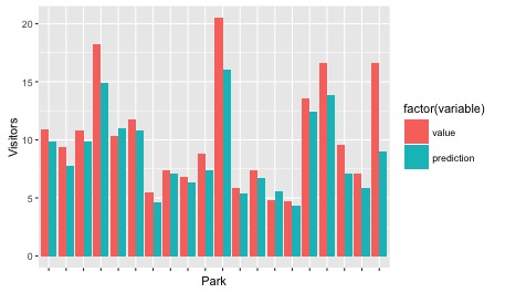
It’s not too far off in a lot of cases, and pretty much everywhere it’s predicting just below what really happened, except for in the case of Disneyland Paris. In a few cases I’m way off, like for Universal Studios Japan, which could possibly due to the stellar performance of all the Universal parks recently. So with this information in hand, here’s my predictions for 2016:
| DISNEY ANIMAL KINGDOM | 10262808.79 |
| DISNEY CALIFORNIA ADVENTURE | 7859777.858 |
| DISNEY HOLLYWOOD STUDIOS | 10161975.17 |
| DISNEYLAND | 15850608.32 |
| DISNEYLAND PARIS | 11303153.4 |
| EPCOT | 11048540.24 |
| EUROPA PARK | 4600339.552 |
| EVERLAND | 7108378.079 |
| HONG KONG DISNEYLAND | 6508497.992 |
| ISLANDS OF ADVENTURE | 7419398.232 |
| MAGIC KINGDOM | 17124831.22 |
| NAGASHIMA SPA LAND | 5305896.091 |
| OCEAN PARK | 6860359.451 |
| SEAWORLD FL | 5440392.711 |
| TIVOLI GARDENS | 4249590.638 |
| TOKYO DISNEY SEA | 13529866.78 |
| TOKYO DISNEYLAND | 15279509.39 |
| UNIVERSAL STUDIOS FL | 7079618.369 |
| UNIVERSAL STUDIOS HOLLYWOOD | 5956300.006 |
| UNIVERSAL STUDIOS JAPAN | 9611463.005 |
If you want to see how these relate to my 2015 predictions, here’s a graph:

Future stuff
As usual, I can still see a whole lot of things I can do to improve this model. At the moment there’s only two variables ‘moving’ with each row – the date and the visitor number. I could add a few more features to my model to improve things – the GDP of the country that park is in for example.
Second, Random Forests are notoriously bad at predicting time series data. In this case I converted the year of the data into a numeric vector rather than a date, adding 1 to the variable for the prediction. Given that each entry for each park was an even number of days apart (365 each row) I think that’s fair, but maybe I can’t treat annual entries that way. But to be fair, there doesn’t seem to be many models particularly good at predicting time series. There are suggestions of using artificial neural networks , but these aren’t particularly noted in time-series or spatio-temporal modelling. I think ‘Data Science’ needs to draw a bit more from Statistics in this case, and I’ll probably look in that direction for improved results in future. Given that it’s annual data I have the advantage of having a long time to process my model, so things likeMCMC using STAN might be promising here.
Finally, I need to get more practice at using ggplot2 for pretty graphs. I know a few tricks but my coding chops really aren’t up to building things with the right labels in the right places, especially when there are really long names. In this article I spent ages trying to fit the names of the parks into the first graph, but in the end I really couldn’t figure it out without making it really ugly. I’d love to be able to add my predictions as extensions on a line plot of the observed data, but that seems like epic level ggplot ninja-ing.
I’ll probably continue to attempt improving my predictions because it makes me feel like a wizard, but at this point I’ll most likely try this by playing with different models rather than ‘feature engineering’, which is most popular in Kaggle.
I’m always keen to hear people’s feedback and I’d love to improve my analyses based on people’s suggestions. Do you think my estimates are accurate, or is there something major I’ve missed?

Hey Jey!
Cool stuff!
Re machine learning for forecasting, this guy compares a bunch of machine learning methods https://ellisp.github.io/blog/2016/11/06/forecastxgb . xgboost seems to perform reasonably, but it looks like auto arima is still better overall. Perhaps you might get better results with combinations of machine learning methods.
Re your ggplot question, are you looking to reproduce your red/blue plot with the tilted axis? You can change the axis text angle with `element_text`, e.g., `theme(axis.title.x = element_text(angle=90))`: http://docs.ggplot2.org/current/element_text.html
Also, for visualising the results, do you mean an extension like in the forecast package autoplot? http://robjhyndman.com/hyndsight/forecast7-ggplot2/
I’ve got some ideas for visualising your results using geom_dumbbell from the ggalt package. I’ll post these in a bit.
LikeLiked by 1 person
I’ve posted some code and resulting plots at this gist, not sure if this is what you were after: https://gist.github.com/njtierney/8a8bd8a69b2102ddb3e0a4aa778ba015
LikeLiked by 1 person
Thanks for the reply 🙂 Turning the label text is one way of doing it, but I’d really like to figure out how to do a dynamic newline character or something to make it look a bit tidier. I’d thought of Hyndmans’ work while I was writing this, and even looked at the thief package he’s written recently (hoping I’d be able to use overall market effects to reign in my predictions or something). I hadn’t thought of geom_dumbell, but I’ll have a look. Hopefully I’ll be able to post an updated graph soon!
LikeLike